gaming profile.
gaming profile.
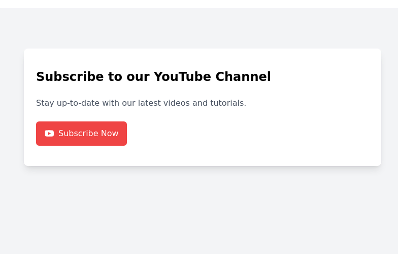
This tailwind example is contributed by Bonimater, on 15-Aug-2025. Component is made with Tailwind CSS v3. It is responsive. similar terms for this example are CTA,banner

Author Bonimater
Related Examples
-
 2 years ago11.1k
 -
 3 years ago10.1k
 -
 SaaS Feature Section
It has a Gradient text headline and CTA buttons
2 years ago9.4k -
 3 years ago10.3k
 -
 3 years ago8.6k
 -
 Animated Gradient Button Component
Button component with smooth hover effects and glass-morphism design. Features expanding gradient animation, rotating icon, and responsive layout. Perfect for call-to-action buttons, landing pages, and web applications. Easy copy-paste Tailwind CSS code ready for integration.
4 months ago720 -
 3 years ago10.4k
 -
 3 years ago14.3k
 -
 3 years ago12.4k
 -
 7 months ago622
 -
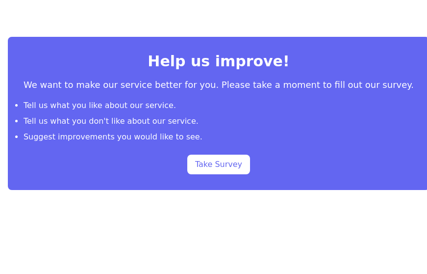
 CTA Call To Action
CTA stands for "Call to Action." It is a marketing term that refers to prompts that encourage users to take a specific action. CTAs are typically found in websites, advertisements, emails, and various marketing materials. The goal of a CTA is to guide users toward a desired action that supports business objectives, such as: 1. Encouraging Engagement: A CTA may prompt users to sign up for a newsletter, follow on social media, or download a resource. 2. Driving Conversion: It can lead users to make a purchase, book a service, or start a free trial. 3. Generating Leads: A CTA might encourage users to fill out a form, requesting more information or a consultation.
8 months ago767 -
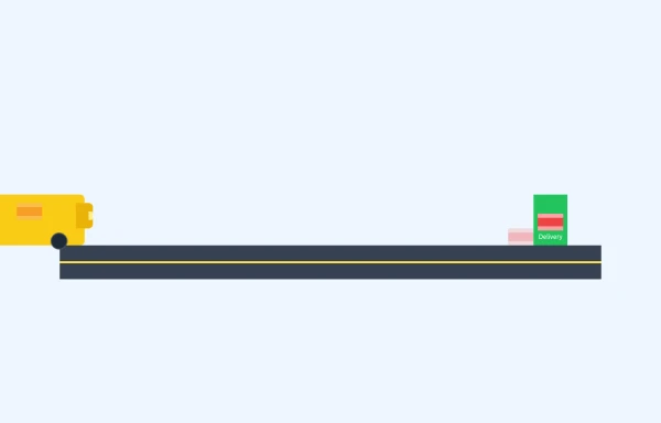 E-Commerce Delivery Truck Animation
This responsive CSS animation showcases a delivery bus transporting a package to its destination, created entirely with Tailwind CSS and pure HTML. The animation features
8 months ago999


Explore components by Tags
Didn't find component you were looking for?
Search from 3000+ components