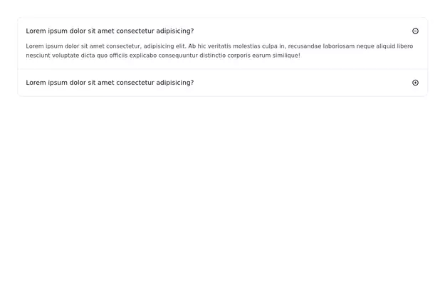
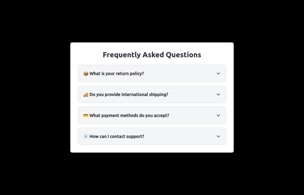
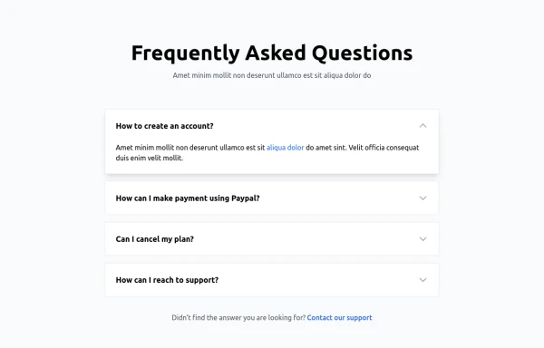
Accordion
The Accordion is a responsive and reusable component designed to display collapsible content sections. It's perfect for FAQs, menu items, or any other grouped information. Each section can expand or collapse individually to show or hide content.
Features:
Mobile-friendly and fully responsive design.
Smooth animation for opening and closing panels.
Supports multiple or single panel expansion.
Highly customizable with props for colors, fonts, and behavior (e.g., single/multiple open panels).
Accessible with keyboard navigation and ARIA attributes.
This tailwind example is contributed by Abhiraj, on 11-Jan-2025. Component is made with Tailwind CSS v3. It is responsive. It supports dark mode. similar terms for this example are Frequently asked questions, QnA,collapsible

Author Abhiraj
Related Examples
-
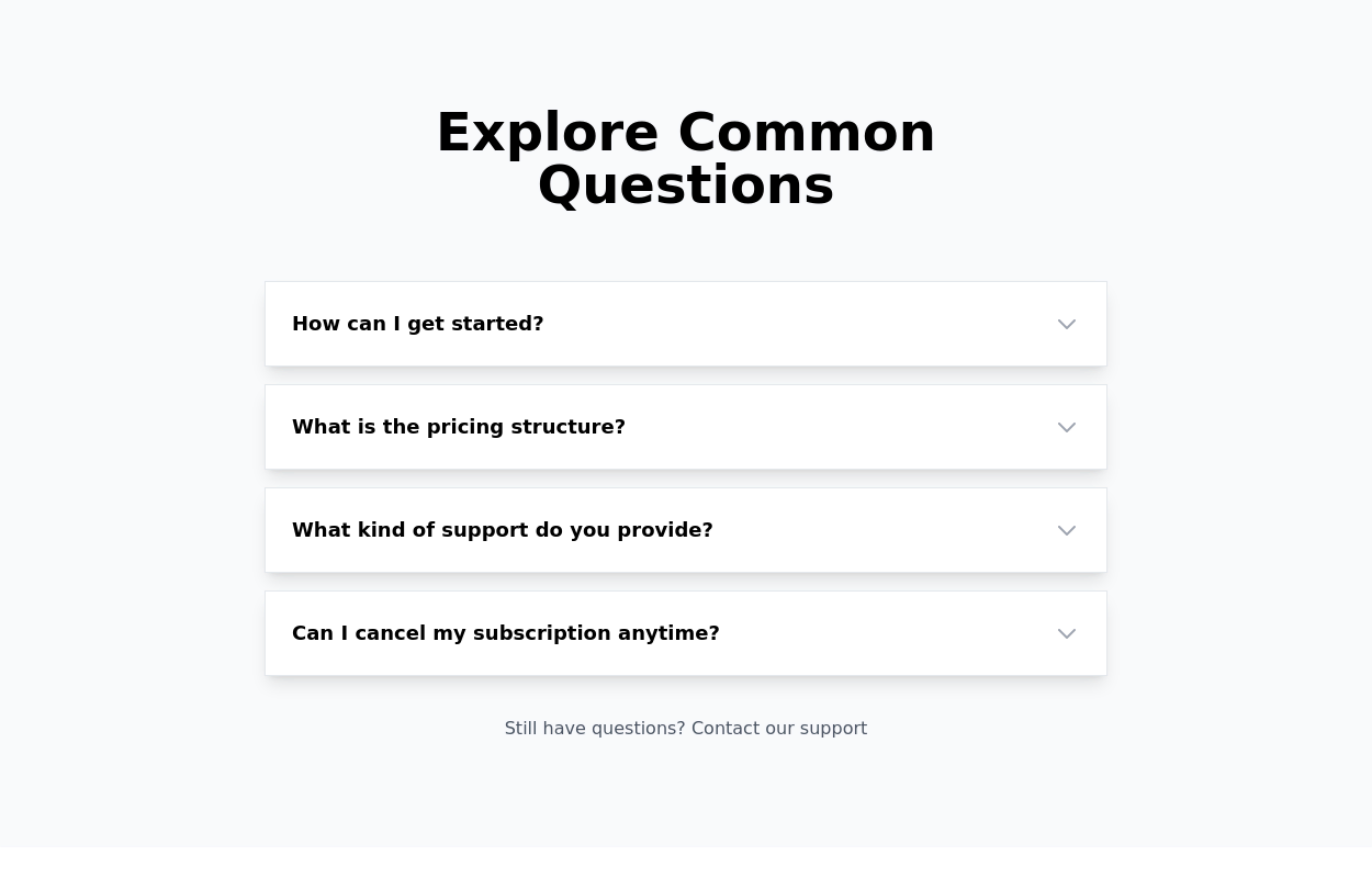
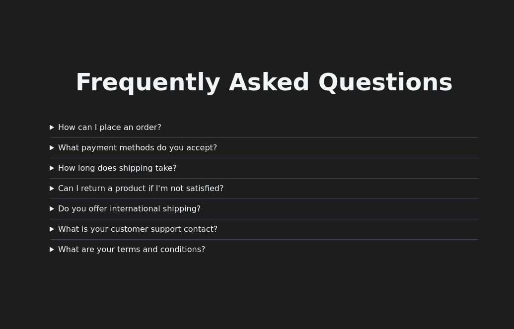
 FAQ section
An expanding frequently asked questions section made without using javascript.
3 years ago11.9k -
Accordion FAQ
FAQ Accordion section without using any javascript
3 years ago19.7k -
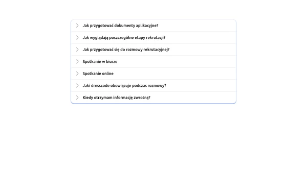
 FAQ Accordion Component
An interactive experience where users can click on questions to reveal or hide the corresponding answers.
2 years ago16.4k -
 1 year ago5.6k
 -
 FAQ.
FAQ.Super simple animated FAQ with tailwind group hoverable accordion open and close.
1 year ago2.4k -
 1 year ago1.3k
 -
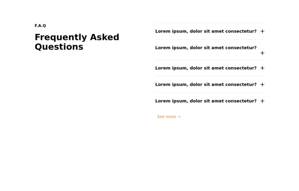
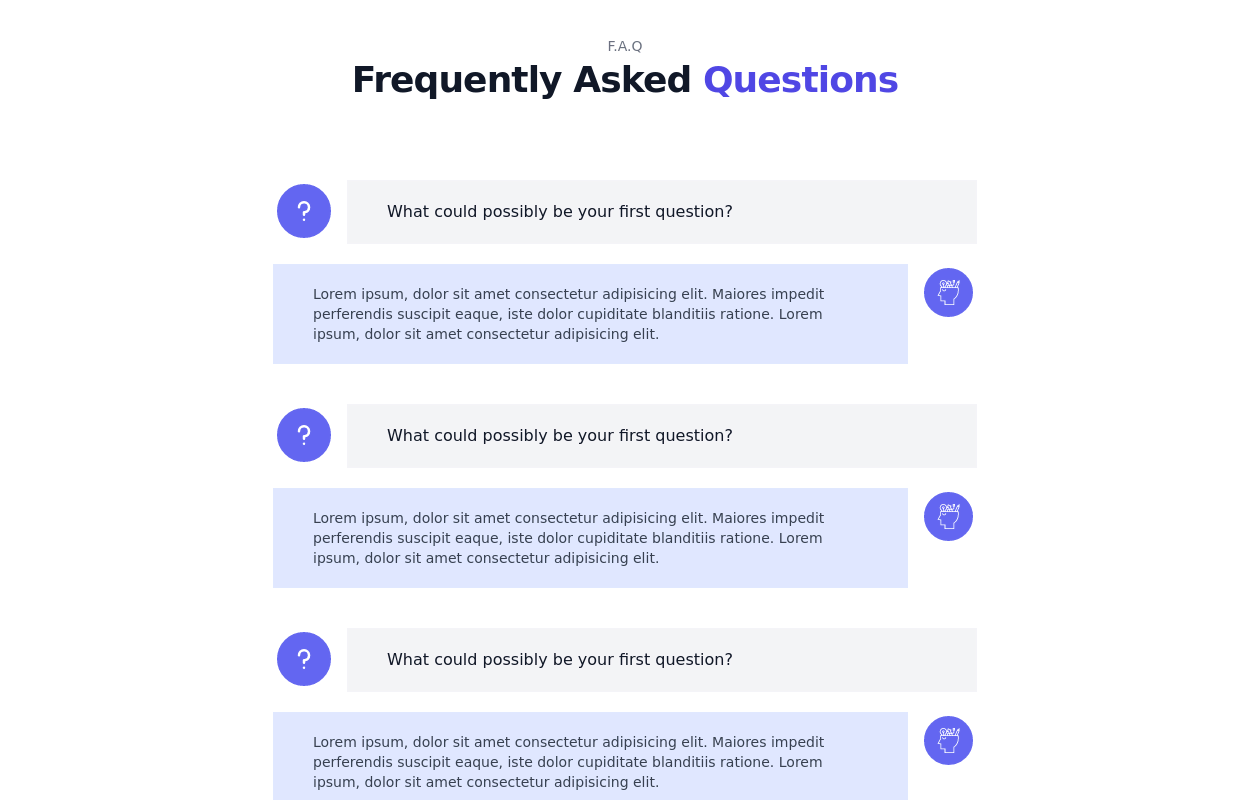
 Frequently Asked Questions
A beautiful and modern accordion FAQ component using HTML & Tailwind CSS with smooth animations.
1 year ago1.7k -
 Attractive Feature Section
With Gradient Color 6 Features
8 months ago981 -
 2 years ago15.6k
 -
 3 years ago12.3k
 -
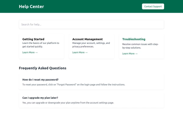 Help Center
Help Center
1 year ago1.1k -
 8 months ago644


Explore components by Tags
Didn't find component you were looking for?
Search from 3000+ components