Heading
This tailwind example is contributed by KULDEEP, on 25-Jun-2025. Component is made with Tailwind v3.4. It is responsive. similar terms for this example are Typography, Title, h1, h2, h3

Related Examples
-
-
 A Code Master Academy
 – Empowering the Next Generation of Tech Leaders in Rwanda 👨💻 I'm Acode Master, the founder of A Code Master Academy, a practical and inclusive coding school based in Rubavu, Rwanda. The academy is dedicated to transforming lives by equipping unemployed youth and passionate learners with job-ready skills in modern software development.
-
 767
-
 Heading
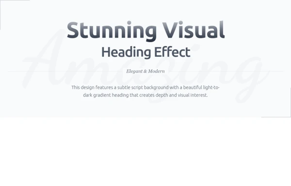
Subtle Script Background - Large, very light script font in the background ("Amazing") Light-to-Dark Gradient Heading - Main heading fades from light gray to dark gray Layered Typography - Secondary heading in medium weight for contrast Elegant Divider - With centered italic text Minimalist Border Accents - Thin borders in corners for sophistication Responsive Design - Scales beautifully on all devices
977 -
-
 11
-
 Infinity Premium Dashboard Tailwind
Website Dashboard Admin with tailwind CSS CDN, responsif via mobile and tablet
1.3k -

-
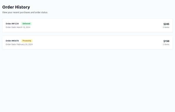 Order History
-
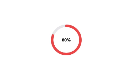 Radial Progress Indicator with TailwindCSS
A sleek and customizable radial progress indicator built with SVG and styled using TailwindCSS. The progress bar is animated with smooth transitions, featuring a circular background, dynamic progress, and centered text or optional imagery. Perfect for showcasing percentages, stats, or any progress-related metrics in your projects.
3.8k -
 Simple Login & Register Page
Login and Register Page using Tailwind, Alpine JS, and Fontawesome
4.2k -
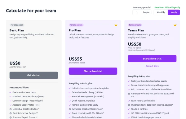 Configurable 3-Tier Responsive Pricing Table
A modern, responsive pricing table component inspired by SaaS layouts, built with HTML and Tailwind CSS. Features three distinct pricing tiers displayed in cards, stacking vertically on smaller screens and transitioning to a 3-column grid on large screens (lg breakpoint). Includes interactive top controls for selecting the number of users and toggling between monthly/yearly billing cycles. Each card uses placeholder content for icons, titles, descriptions, features (with checkmarks/info icons), and distinct call-to-action buttons, making it easily adaptable. Styled with subtle background colors and clear typography for excellent readability.
1.6k







Browse by topic
Explore components by Tags
Jump straight to the UI pattern you need.
Can't find it?
Didn't find the component you were looking for?
Search across 3,000+ community-built components and grab the code in seconds.