Exapnd and collapse button for large content
Truncate and expand on click large content with javascript.
uses line clamp.
This tailwind example is contributed by Komal Jain, on 17-Jul-2024. Component is made with Tailwind CSS v3. It is responsive.

Author Komal Jain
Related Examples
-
 Exapnd and collapse button for large content without javascript
Truncate and expand on click large content without using JavaScript.
1 year ago2.3k -
Background gradient changing button
Automatic and continuously gradient-changing button. Cyclic color changing button.
2 years ago11.3k -
 Buttons popup on hover
Popup buttons on hover
3 years ago14.6k -
 Neo-Brutalism UI Button Collection - Bold CSS Button Styles withTailwind CSS
Bold, chunky neo-brutalism buttons with thick borders and strong shadows for modern web design. Explore our collection of vibrant, high-contrast CSS buttons with hover effects and dark mode support.
3 months ago686 -
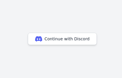 Continue with Discord button
Login with the Discord button for social login
2 years ago13k -
 1 year ago2.8k
 -
 shadcn Button
button
1 year ago2.6k -
 hero modern
hero modern
2 months ago356 -
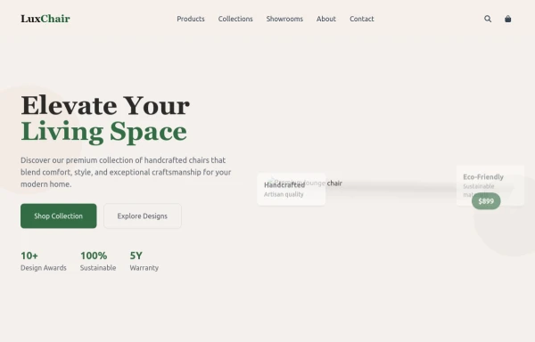 chair
chairby salvator
10 months ago1.1k -
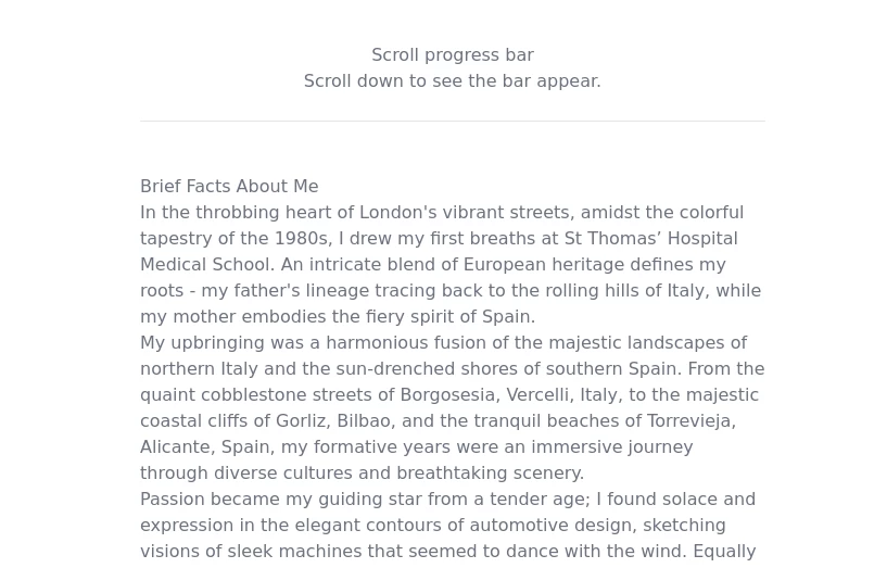 Progress bar with Tailwind CSS and Javascript
How to a create a scroll progress bar with Tailwind CSS and Javascript
1 year ago2.7k -
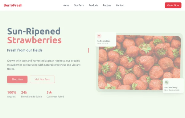 strawbery
by salvator
10 months ago1.1k -
 3 years ago13.2k


Explore components by Tags
Didn't find component you were looking for?
Search from 3000+ components