Sign in with facebook button
This tailwind example is contributed by Conan Hilton, on 26-Sep-2022. Component is made with Tailwind CSS v3. It is responsive.

Author Conan Hilton
Related Examples
-
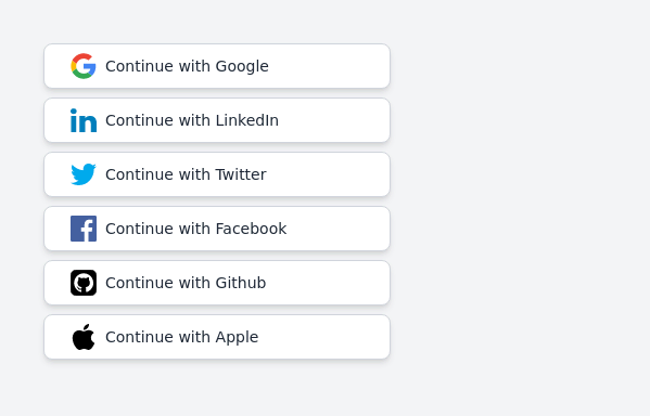 Continue with social login buttons (google, linkedin, twitter, facebook, github, apple)
Login/signup buttons for Google, LinkedIn, Twitter, Facebook, GitHub, and Apple
2 years ago17.7k -
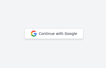 Continue with Google button
Login with google button for social login.
2 years ago24.6k -
 1 year ago3.2k
 -
![Material 3 Buttons [Light]](https://tailwindflex.com/storage/thumbnails/material-3-buttons-light/canvas.min.webp?v=18) Material 3 Buttons [Light]
Material 3 Buttons [Light]Buttons that conform to Google's Material 3 design guidelines
10 months ago1k -
Glowing gradient button
Button on black background
3 years ago39.6k -
 Social buttons
Mono-color Social buttons change colors according to your need
3 years ago12.2k -
 Download App Buttons
Ready-to-use Apple App Store and Google Play Store download buttons with official branding and styling
4 months ago608 -
 3 years ago16.6k
 -
 hero modern
hero modern
2 months ago357 -
 3 years ago10.1k
 -
 3 years ago12.8k
 -
 Animated Button
on hover show icon
1 year ago2.7k


Explore components by Tags
Didn't find component you were looking for?
Search from 3000+ components