Exapnd and collapse button for large content without javascript
Truncate and expand on click large content without using JavaScript.
This tailwind example is contributed by Komal Jain, on 17-Jul-2024. Component is made with Tailwind CSS v3. It is responsive.

Author Komal Jain
Related Examples
-
Exapnd and collapse button for large content
Truncate and expand on click large content with javascript. uses line clamp.
1 year ago2.7k -
1 year ago2.1k
-
 1 year ago2.5k
 -
 3 months ago469
 -
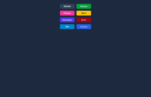 Elegant Buttons
Useful Tailwind classes for creating several types of basic buttons.
10 months ago957 -
Color Changing Gradient Button
Color Changing Gradient Button
1 year ago3.7k -
 SCROLL ABAJO
para poner que a llegado al final de la pagina
7 months ago965 -
 Buttons popup on hover
Popup buttons on hover
3 years ago14.6k -
 Button
Material Button
1 year ago2.5k -
 3 years ago11.7k
 -
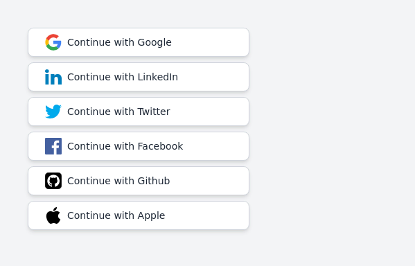 Continue with social login buttons (google, linkedin, twitter, facebook, github, apple)
Login/signup buttons for Google, LinkedIn, Twitter, Facebook, GitHub, and Apple
2 years ago17.7k -
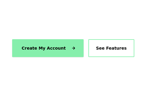
 Call to Action (for app stores)
Download app section with Playstore and Appstore button
3 years ago11.8k


Explore components by Tags
Didn't find component you were looking for?
Search from 3000+ components