Basic CTA card
This tailwind example is contributed by kishan pc, on 07-May-2024. Component is made with Tailwind CSS v3. It is responsive. It supports dark mode. similar terms for this example are CTA,banner

Author kishan pc
Related Examples
-
 2 years ago11.7k
 -
 Call to Action
CTA with Dark and Shadow colors
6 months ago919 -
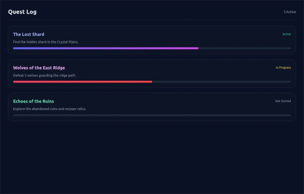 asimple game Quest Log
asimple game lay out Quest Log
3 months ago434 -
 10 months ago1.6k
 -
 3 years ago15.2k
 -
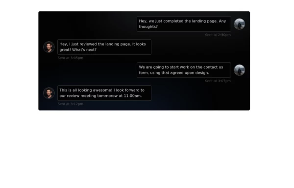 Chat Box for Marketing
An Onyx component. This chat box is great for SAAS landing pages where you want to mock customer interactions or expectations.
1 year ago1.8k -
 CTA block for "Take our survey"
Get users attention to he survey form
2 years ago9.7k -
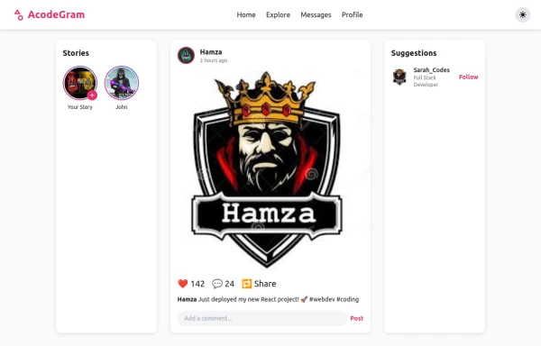 Acode master
Welcome to Hamza's official portfolio — a creative developer blending modern design with powerful code. Explore animations, projects, and innovations crafted with HTML, Tailwind CSS, and passion.
7 months ago548 -
 Animated Gradient Button Component
Button component with smooth hover effects and glass-morphism design. Features expanding gradient animation, rotating icon, and responsive layout. Perfect for call-to-action buttons, landing pages, and web applications. Easy copy-paste Tailwind CSS code ready for integration.
3 months ago582 -
 2 years ago13.2k
 -
 Call to Action section
CTA with clear message and big button
1 year ago1.9k -
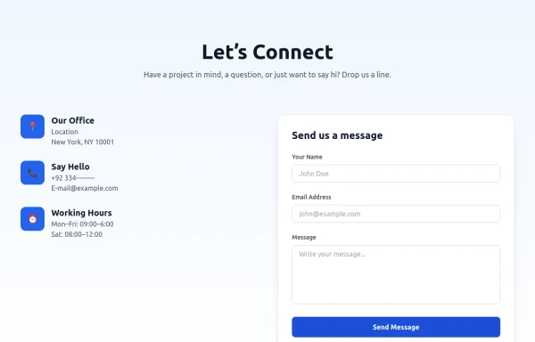 Modern Contact Section with Responsive Grid and Glassmorphic Form
A clean, professional contact section with a dual-column layout featuring contact details and a sleek glassmorphism-inspired form. Fully responsive with Tailwind CSS, supporting both light and dark modes.
5 months ago618


Explore components by Tags
Didn't find component you were looking for?
Search from 3000+ components