Call to Action
CTA with Dark and Shadow colors
This tailwind example is contributed by KULDEEP, on 24-Jun-2025. Component is made with Tailwind CSS v3. It is responsive. similar terms for this example are CTA,banner,Front page

Author KULDEEP
Related Examples
-
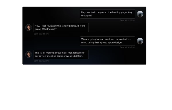 Chat Box for Marketing
An Onyx component. This chat box is great for SAAS landing pages where you want to mock customer interactions or expectations.
1 year ago1.9k -
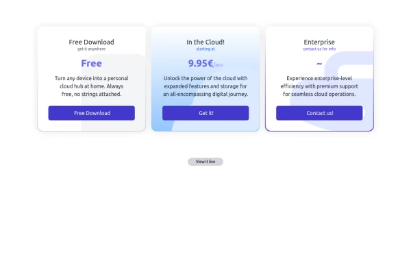 Interactive Pricing Table
This modern pricing component features a visually appealing, responsive layout with smooth hover effects, making it ideal for showcasing different plans and subscription tiers. Design and Features: ✅ Elegant Gradient Backgrounds • Each pricing card has a unique gradient overlay, transitioning from soft gray, blue, or indigo to white, enhancing contrast and visual appeal. • The rounded-2xl design ensures a polished and smooth aesthetic. ✅ Interactive Hover Effects • Cards have a subtle hover shadow enhancement, making them pop on interaction (hover:shadow-[0_0px_25px_0px_rgba(0,0,0,0.2)]). • Slight floating effect (hover:translate-y-[-5px]) gives the illusion of elevation on hover. ✅ Pricing & Plan Details • Each card presents a plan title, a short subtitle, and a bold price display (text-3xl font-extrabold text-indigo-500). • Supports free, subscription-based, and enterprise-tier pricing, ensuring flexibility for different business models. ✅ Call-to-Action Buttons • Each plan features a highly visible CTA button (bg-indigo-700 text-white rounded-md). • The buttons change color on hover (hover:bg-indigo-500) and expand slightly, encouraging user interaction. ✅ Animated Background Icons • A large, transparent icon (text-[500px] text-gray-100) dynamically moves on hover (group-hover:-translate-y-8 group-hover:-translate-x-8), adding depth and a premium feel. This pricing component is perfect for SaaS platforms, digital subscriptions, and service offerings, ensuring a modern, sleek, and engaging user experience. 🚀
1 year ago1.7k -
 10 months ago2.2k
 -
 The Future of Web Development
love my product
8 months ago885 -
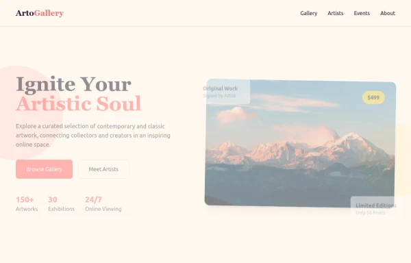 ArtoGallery
Explore a curated selection of contemporary and classic artwork, connecting collectors and creators in an inspiring online space.
8 months ago1.2k -
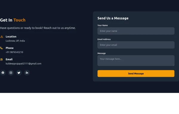 Contact Us Form
CTAs help convert visitors into action-takers (customers, subscribers, etc.), while Contact Us forms enable easy communication, building trust and support. Both are vital for engaging visitors and achieving your website’s objectives.
7 months ago770 -
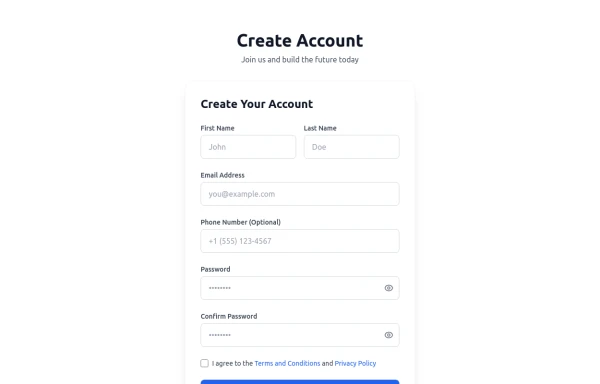 Registration Form with Validation & Success State
A modern and interactive registration form built using Tailwind CSS and Alpine.js, designed for seamless user onboarding with real-time validation and elegant animations. This component includes client-side form validation, dynamic password visibility toggles, and a success confirmation screen with personalized feedback. It’s fully responsive, dark mode–ready, and styled for modern SaaS or startup platforms. ✨ Key Features 🧠 Real-time input validation for required fields (name, email, password, etc.) 🔒 Show/hide password toggle with animated SVG icons ✅ Success message with user details after submission 💨 Animated transitions using Alpine.js 🌙 Dark mode and light mode compatible 📱 Fully responsive across all screen sizes 🧩 Built with pure Tailwind CSS and Alpine.js (no external libraries) 💡 Perfect for: Registration or sign-up pages SaaS onboarding flows Portfolio or agency login systems Form validation demos or UI component libraries
4 months ago249 -
 e-commerce website landing page template with Tailwind CSS.
A clean, responsive e-commerce & blog template built with Tailwind CSS. Features light/dark mode, dynamic featured posts, hero, CTA, and SEO-ready sections.
1 month ago440 -
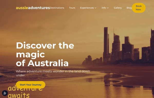
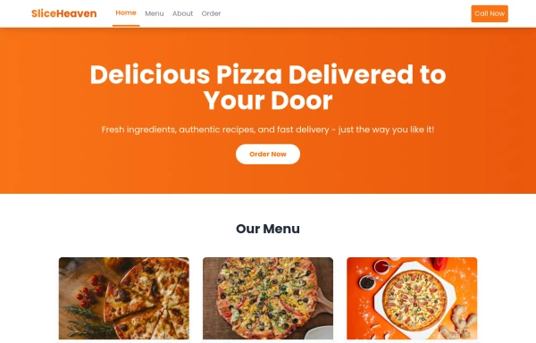 SliceHeaven
delivering pizza
8 months ago730 -
 Call to example
Call to example using radial-gradient
2 years ago8.8k -
 Premium Gaming UI Card, Form & Animated Button (Tailwind CSS)
A modern, senior-level gaming UI built with Tailwind CSS focusing on spacing, typography, and calm visual hierarchy rather than noisy effects. This component set includes: A premium gaming card with clear content structure and outcome-focused copy A clean player signup form with accessible focus states and minimal visual noise A custom animated button using a restrained light-sweep effect for premium interaction feedback Designed to resemble real production gaming platforms rather than demo or template UI. Fully responsive, copy-paste ready, and easy to extend for real-world projects.
1 month ago138 -
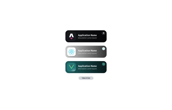 Applications Showcase
This is a stylish and interactive application showcase component designed for web use. It features the following elements: Background Styling: The main container has a rounded-rectangle shape (rounded-3xl) with a subtle white base overlaying a high-resolution background image, styled with background-size: 600px for an artistic touch. The image itself dynamically serves as a backdrop, giving the component a layered appearance. Main Icon: A small circular icon, located at the top-right corner, appears with smooth hover effects: Enlarges to double its size (scale-[2]). Rotates (rotate-[410deg]). Moves diagonally upwards-right (translate-x-3, -translate-y-3). These transitions occur over a duration of 1 second (transition duration-1000). Overlay Gradient: A transparent gradient overlay (bg-gradient-to-l) adds a polished depth effect, transitioning from black (from-black/80) to lighter shades. App Icon and Info: Icon: The app icon is a smaller, bordered square image (rounded-2xl) with hover shrink animations (group-hover:scale-95). Text: A bold application title (text-md font-semibold) with hover-animated underline effects that gradually expand from left to right. A short app description styled as secondary text. Call-to-Action Button: Below the card is a subtle, rounded button (rounded-full) encouraging interaction. It features: A hover effect with color inversion (gray to black). A lift effect (hover:-translate-y-1) when hovered. This component is perfect for modern app showcases, offering a dynamic, user-friendly visual experience. It ensures a professional look while engaging users through smooth animations and clear calls to action.
1 year ago2.6k


Explore components by Tags
Didn't find component you were looking for?
Search from 3000+ components