Call to Action section
CTA with clear message and big button
This tailwind example is contributed by Curtis Bickler, on 03-Oct-2024. Component is made with Tailwind CSS v3. It is responsive. It supports dark mode. similar terms for this example are CTA,banner

Author Curtis Bickler
Related Examples
-
 11 months ago1.5k
 -
 carde Iptplus
Iptplus carde
3 months ago258 -
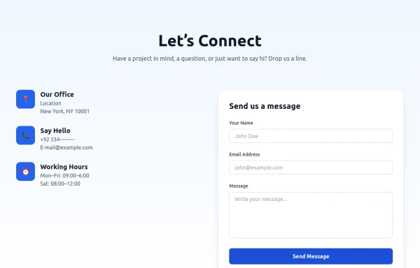 Modern Contact Section with Responsive Grid and Glassmorphic Form
A clean, professional contact section with a dual-column layout featuring contact details and a sleek glassmorphism-inspired form. Fully responsive with Tailwind CSS, supporting both light and dark modes.
7 months ago674 -
 CTA Call To Action
CTA stands for "Call to Action." It is a marketing term that refers to prompts that encourage users to take a specific action. CTAs are typically found in websites, advertisements, emails, and various marketing materials. The goal of a CTA is to guide users toward a desired action that supports business objectives, such as: 1. Encouraging Engagement: A CTA may prompt users to sign up for a newsletter, follow on social media, or download a resource. 2. Driving Conversion: It can lead users to make a purchase, book a service, or start a free trial. 3. Generating Leads: A CTA might encourage users to fill out a form, requesting more information or a consultation.
9 months ago850 -
 Geaux Code CTA Section
CTA with background patterns
1 year ago2k -
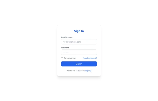 Sign In Form
Clean and modern Sign In form with email, password, and "Forgot password" link. Fully responsive and styled with Tailwind CSS, perfect for SaaS platforms.
8 months ago839 -
 2 years ago12.9k
 -
 Hero section with a gradient background
With text overlay, and a call-to-action button
2 years ago20.3k -
 CTA Responsive
Gradient Style CTA
7 months ago586 -
![Component-[callToAction]](https://tailwindflex.com/storage/thumbnails/component-calltoaction/canvas.min.webp?v=2) 1 year ago1.1k
1 year ago1.1k -
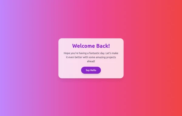 Boimator welcoming back
Boimator welcoming back
7 months ago522 -
 Call to action
Call to action section. find it makecomponents.com
1 year ago2.2k


Explore components by Tags
Didn't find component you were looking for?
Search from 3000+ components