Navbar with two CTA buttons
This tailwind example is contributed by Juraj, on 14-Feb-2025. Component is made with Tailwind CSS v3. It is responsive. similar terms for this example are CTA,banner

Author Juraj
Related Examples
-
 e-commerce website landing page template with Tailwind CSS.
A clean, responsive e-commerce & blog template built with Tailwind CSS. Features light/dark mode, dynamic featured posts, hero, CTA, and SEO-ready sections.
1 month ago523 -
 Tesla Navbar
a tesla navbar
1 year ago2.8k -
 portifolio
skills
9 months ago1k -
 The Future of Web Development
love my product
9 months ago886 -
 1 year ago2.3k
 -
 Banner for app download
Show App Download Buttons for the App Store and Play Store
1 year ago1.9k -
 2 years ago27.4k
 -
 omerlinkStream
omerlinkStream
1 month ago461 -
 8 months ago727
 -
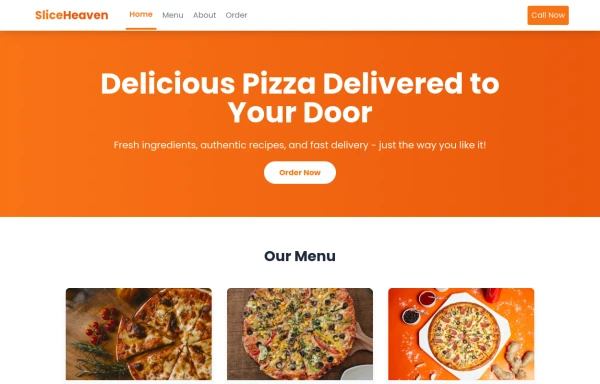 SliceHeaven
delivering pizza
8 months ago807 -
 Solo leveling
Animation & movie field,videos,games.
9 months ago931 -
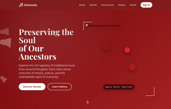 tradition music
by salvator
9 months ago854


Explore components by Tags
Didn't find component you were looking for?
Search from 3000+ components