- Home
-
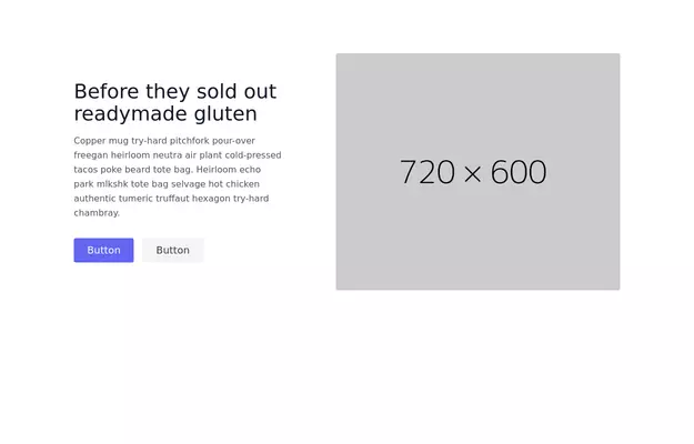
Minimalistic hero section
Minimalistic hero section
This tailwind example is contributed by Sophia Baker, on 19-Jan-2023. Component is made with Tailwind CSS v3. It is responsive. similar terms for this example are CTA,banner
Author Sophia Baker
Related Examples
-
Product Page
Showcase for the product.
3 years ago32.7k -
Hero Section
Full width hero section for landing pages
3 years ago13.8k -
3 years ago12.4k
-
3 years ago15.2k
-
3 years ago13k
-
3 years ago9k
-
3 years ago12.7k
-
Hero section with a gradient background
With text overlay, and a call-to-action button
2 years ago20.1k -
SaaS Feature Section
It has a Gradient text headline and CTA buttons
2 years ago9.4k -
Product Page
Showcase for the product.
1 year ago2.4k -
Chat Box for Marketing
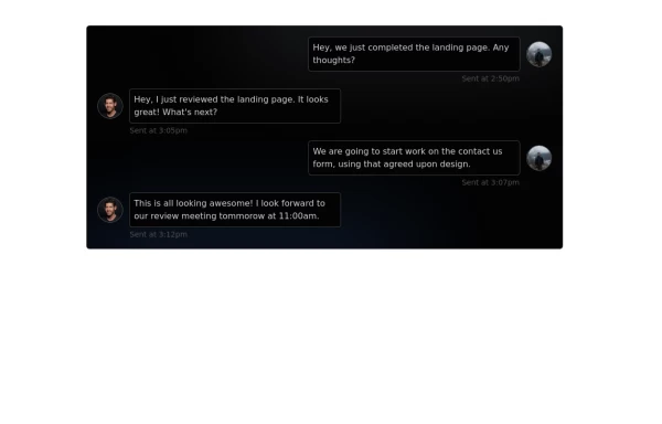
An Onyx component. This chat box is great for SAAS landing pages where you want to mock customer interactions or expectations.
1 year ago1.9k -
1 year ago2.6k
Explore components by Tags
Didn't find component you were looking for?
Search from 3000+ components


