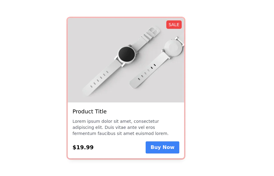
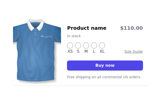
Product Card
This tailwind example is contributed by Arya, on 08-Oct-2022. Component is made with Tailwind CSS v3. similar terms for this example are Product Showcase, Product card

Author Arya
Related Examples
-
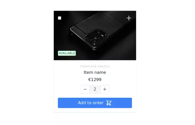
 Product page
Product Information Card component that provides comprehensive details about a product, including an image, name, description, price, availability, color and size options, and a product description.
3 years ago48.6k -
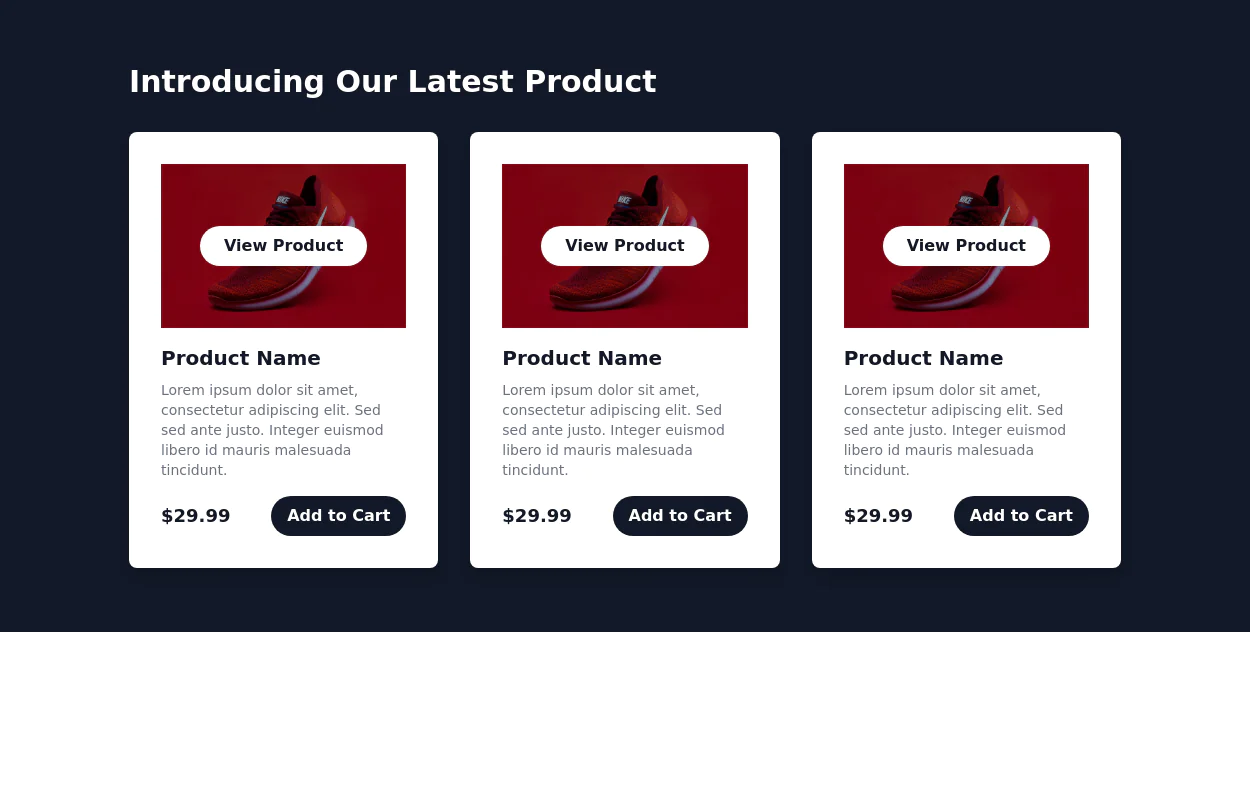
 Responsive products grid
Responsive product card grid using tailwind CSS.
3 years ago44.9k -
 3 years ago13.9k
 -
 2 years ago27.2k
 -
 3 years ago13.9k
 -
 3 years ago12.8k
 -
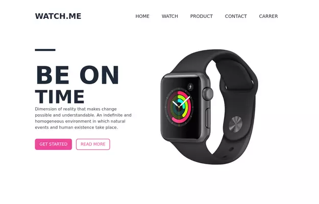 Product Page
Showcase for the product.
3 years ago33.1k -
 3 years ago31.6k
 -
 Product Carousel with Tailwind CSS, Swiper & Alpine.js
A modern, responsive product carousel built with Tailwind CSS, Swiper, and Alpine.js. The component features smooth sliding animations, autoplay, and custom navigation controls. Each product card uses a flexible Tailwind layout and includes dynamically generated demo images, making it easy to drop into any landing page, marketing site, or product showcase. Ideal for showcasing products in a clean, lightweight, and highly customizable way.
1 month ago169 -
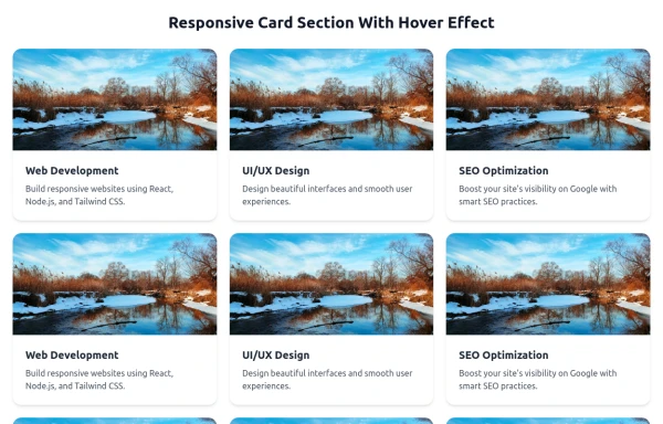 Responsive Card Section With Hover Effect
added more cards with ui friendly
7 months ago618 -
 DailyDev Card
Card -based card used in the Dailydev Card, this is created to be modified to taste of each user
1 year ago1.9k -
 Products information
Products information services and products display
1 year ago1.3k


Explore components by Tags
Didn't find component you were looking for?
Search from 3000+ components