Card Component
A Simple Card Component with full responsiveness and dark mode supported
This tailwind example is contributed by Shariar Hasan, on 29-Feb-2024. Component is made with Tailwind v3.4. It is responsive. It supports dark mode. similar terms for this example are Product Showcase, Product card

Related Examples
-
 Product page
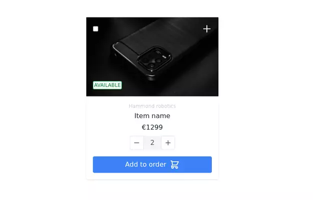
Product Information Card component that provides comprehensive details about a product, including an image, name, description, price, availability, color and size options, and a product description.
49.4k -
-
 Features
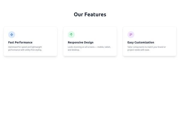
A clean, responsive feature section with icons, smooth hover effects, soft backgrounds, and clear titles for modern website designs.
1.1k -
 Profile, Team or Testimonial
4.1k -
-
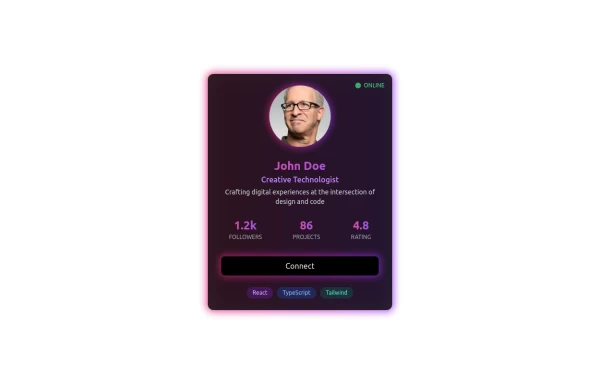
 Beautiful info cards
Responsive and minimal design
11k -
-
 Créer une story
-
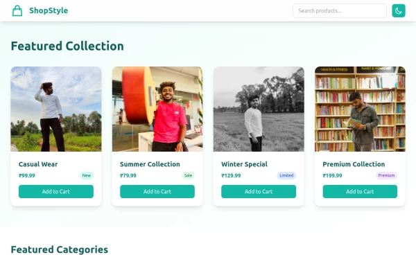 shoping products
Shopping products
2.3k -
 3D Modern Pricing Card
Here's a modern, reusable Pricing Card component that's highly popular on platforms like TailwindFlex. It's clean, responsive, and designed for conversions.
1.4k -
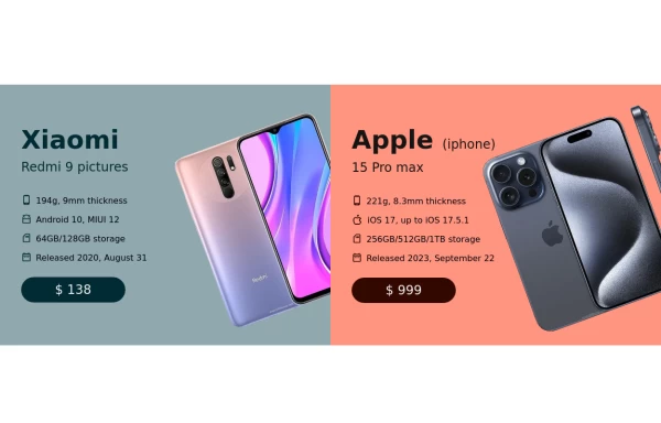 HighLight
Highlight section. Find it makecomponents.com
2.6k -
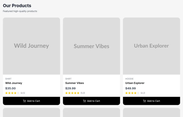 877








Browse by topic
Explore components by Tags
Jump straight to the UI pattern you need.
Can't find it?
Didn't find the component you were looking for?
Search across 3,000+ community-built components and grab the code in seconds.