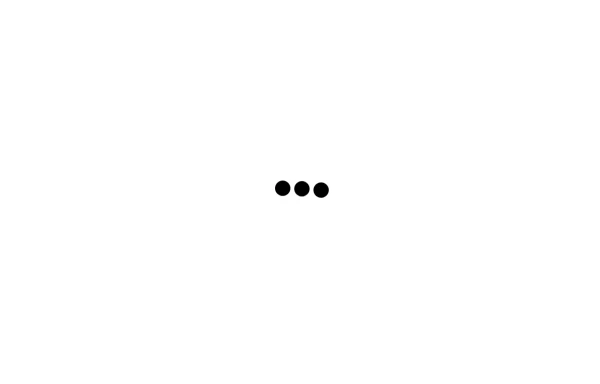
Loading Spinner Component - Animated Circle Loader
Loading spinner component featuring a smooth animated circle loader with dashed border animation. Perfect for website loading states, content loading indicators, and improving user experience during page transitions. Easy to implement and customize for any project.
This tailwind example is contributed by Homayoun, on 26-Sep-2025. Component is made with Tailwind CSS v3. It is responsive. It supports dark mode. similar terms for this example are loading, loader,Transitions

Author Homayoun
Related Examples
-
Loading dots
Black Loading dots
2 years ago39.5k -
 1 year ago5.7k
 -
 Spinner
The Spinner is a simple and visually appealing component that indicates ongoing processes like loading or data fetching. It's a great way to improve user engagement and reduce frustration during wait times. Different styles and animations (circular, dots, pulsating). Customizable size, color, and speed. Easy to integrate with loading states in any app. Lightweight and responsive.
1 year ago2.2k -
 Loading dots
Black Loading dots
1 year ago1.9k -
 10 months ago2k
 -
background animation
background animation
2 years ago50.7k -
 Amazing 3D Login and Registiration Aniamation Form
create a stunning 3D animated background with floating geometric shapes, particle effects, and interactive elements using React, Three.js, and Tailwind CSS. This will be fully responsive and visually captivating.
9 months ago1.1k -
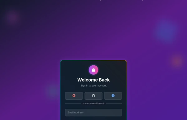
 Login Form
A modern Tailwind CSS animated login form featuring smooth transitions, premium UI styling, responsive layout, and interactive input effects. Designed for admin panels, SaaS dashboards, and secure web applications, this login template delivers a clean light-theme interface with professional animations and a high-end user experience.
2 weeks ago43 -
Button
Button When Hover and page Reload then Button text will show the animation
1 year ago2.7k -
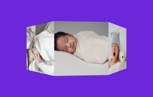 3D Animated Image Gallery
3D Animated Image Gallery
1 year ago8.9k -
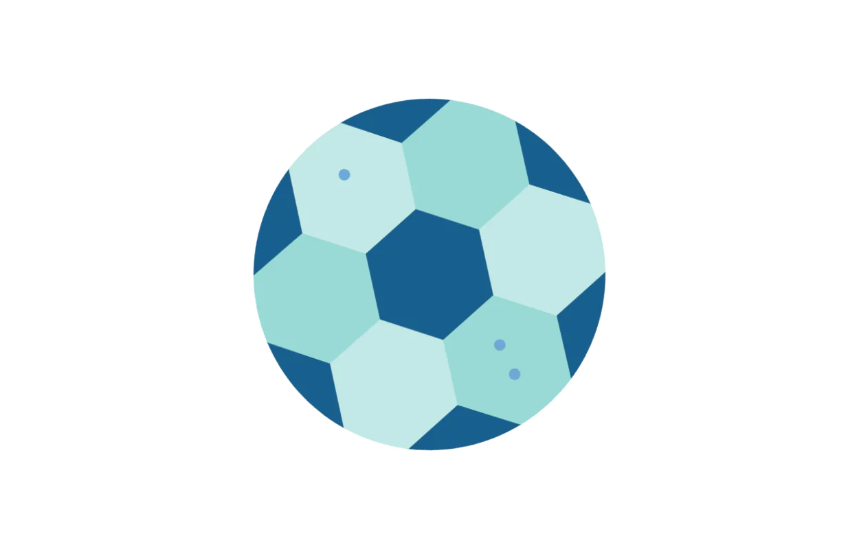 Matha ghurainna Ball
Tailwind Spinner
2 years ago5.9k -
 Loading Overlay
Add loading overlay to your divs
3 years ago24.8k


Explore components by Tags
Didn't find component you were looking for?
Search from 3000+ components