visacardes
I'll create professional Visa card components with realistic styling and multiple card types
This tailwind example is contributed by ishimwe prince, on 22-May-2025. Component is made with Tailwind CSS v3. It is responsive.

Author ishimwe prince
Related Examples
-
 Card KPI
Targetas ahora con un grafico
1 month ago359 -
 6 months ago228
 -
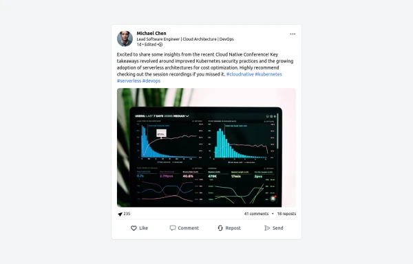 LinkedIn Post UI Mockup
A static HTML and Tailwind CSS component designed to replicate the user interface of a LinkedIn post. This mockup accurately represents the post structure including the header (avatar, name, headline, timestamp), content area (text, optional media), engagement statistics (likes, comments, reposts), and the action bar (Like, Comment, Repost, Send). It's fully responsive, supports light and dark themes, and uses appropriate iconography and styling to closely mimic the LinkedIn feed experience.
8 months ago1.1k -
 7 months ago1.3k
 -
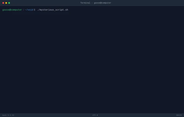 TASK FAILED SUCCESSFULLY
TradingGoose Ep2 MockUp
3 months ago242 -
 hello world
by salvator
7 months ago525 -
 Coffee & Tea
Coffee: A brewed drink prepared from roasted seeds, called coffee beans, of the coffee plant. Tea: An agricultural product of the leaves, leaf buds, and internodes of various cultivars and sub-varieties of the Camellia sinensis plant, processed and cured using various methods.
7 months ago866 -
 cards
cardscards with background animation
2 years ago11.6k -
 Tailwind CSS Blog sharing buttons with blog details
Introducing our Blog Sharing Buttons with Blog Details component, designed to enhance the social sharing experience on your blog posts.
1 year ago2.1k -
 4 weeks ago99
 -
 1 month ago184
 -
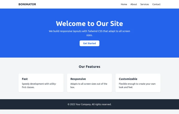 BONIMATOR Responsive Tailwind Starter Template
Responsive Tailwind Starter Template
6 months ago797


Explore components by Tags
Didn't find component you were looking for?
Search from 3000+ components