BONIMATOR Responsive Tailwind Starter Template
Responsive Tailwind Starter Template
This tailwind example is contributed by Bonimater, on 14-Jun-2025. Component is made with Tailwind CSS v3. It is responsive.

Author Bonimater
Related Examples
-
 3 years ago13.8k
 -
 4 months ago271
 -
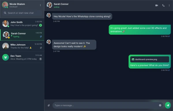 Best Chatting dashboard
create a modern WhatsApp-like chat dashboard with 3D effects, animations, and a sleek design. This will be a static view showcasing the interface with Nicole Shalom as the developer.
9 months ago1.1k -
 Profile Card with Transparent
Dynamic Background: Darker gradient background for better contrast Floating colored blobs for visual interest Profile Image Glow: Added a gradient glow effect behind the profile picture Smoother hover transition Typography Improvements: Larger, bolder name text Subtle hover underline animation for the name Better spacing and hierarchy
8 months ago1k -
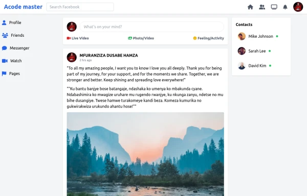 SocialSphere: A Full-Stack Social Media Platform
SocialSphere is a full-stack social media platform inspired by Facebook, built using HTML CSS
9 months ago867 -
 Cafee shop
help to buy something that can help you to relax
9 months ago1.3k -
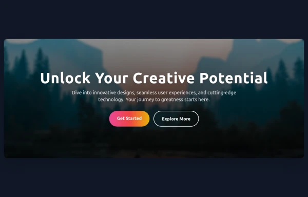 Hero Section
Responsive Hero Section for you Project Background Image: A stunning, high-quality Unsplash photo that creates a unique visual impact. Overlay: Semi-transparent black overlay with blur effect for readability and a modern aesthetic. Content Area: Centered with a gradient background overlay for contrast, bold headline, engaging subtext. Buttons: Vibrant gradient and clean border with smooth hover animations to draw attention. Responsive Design: Looks great on all screen sizes with adaptable padding and font sizes.
8 months ago1.5k -
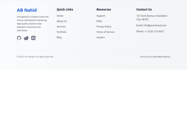 Responsive Light Mode Footer Component
This is a fully responsive and reusable light-mode footer component designed by ABNahid Agency. Built with a clean structure and optimized for modern web applications, this footer features essential sections, including About, Services, Contact, and Social Links. Ideal for personal portfolios, business websites, or startup platforms—plug and play in your React or HTML project.
7 months ago587 -
 Get in Touch – Let's Connect! Responsive Contact Section Using TailwindCSS
Need a website, have a project idea, or just want to say hello? Feel free to reach out! My Contact Section is built with Tailwind CSS, ensuring a clean, responsive, and user-friendly experience. Drop me a message, and let's create something amazing together!
11 months ago1.5k -
 pricing
pricing
7 months ago615 -
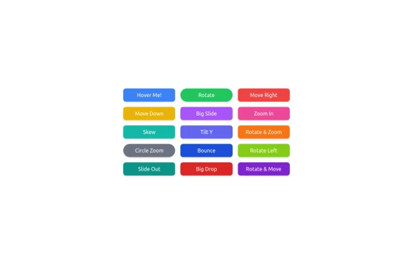 button animation
button animation big
9 months ago993 -
 FLESH & BONE
Stranded in the heart of a cannibal-infested jungle, you must make unthinkable choices to survive. How far will you go to see another sunrise?
3 months ago288


Explore components by Tags
Didn't find component you were looking for?
Search from 3000+ components