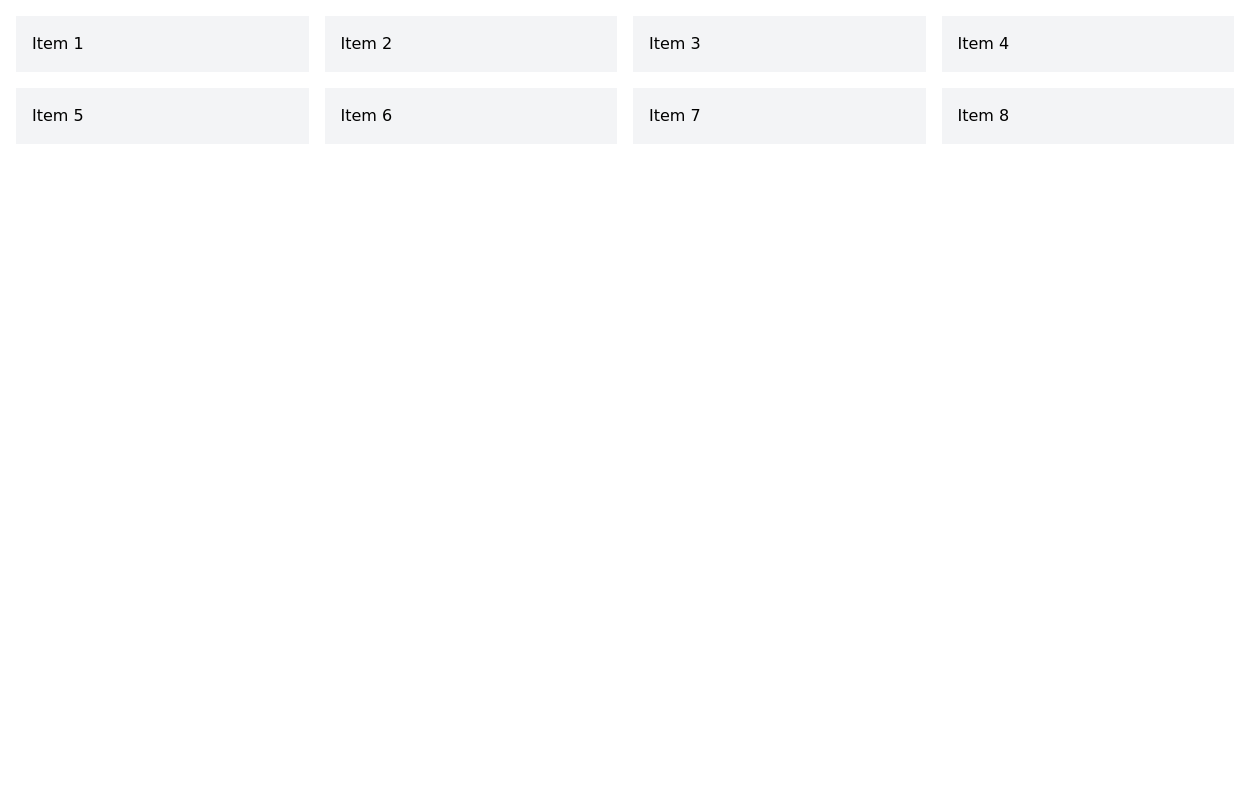
Responsive grid example
This tailwind example is contributed by Charlotte Dupont, on 05-Mar-2023. Component is made with Tailwind CSS v3. It is responsive.

Author Charlotte Dupont
Related Examples
-
 3 years ago22.3k
 -
 Responsive Card Grid
Tailwind CSS responsive grid for feature listing. The cards have a teal background, rounded corners, and a concise display of feature titles, descriptions, and a "Learn More" link.
3 years ago52.4k -
 Grid
GridGrid Grid-Cards
1 year ago2.1k -
 2 months ago392
 -
 3 years ago10.4k
 -
 1 year ago2.6k
 -
 3 years ago10.3k
 -
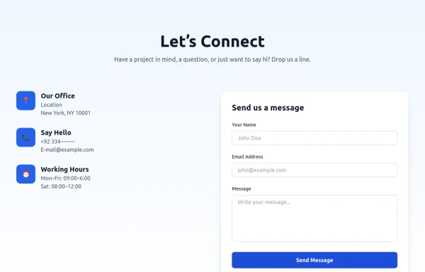 Modern Contact Section with Responsive Grid and Glassmorphic Form
A clean, professional contact section with a dual-column layout featuring contact details and a sleek glassmorphism-inspired form. Fully responsive with Tailwind CSS, supporting both light and dark modes.
8 months ago677 -
 3 years ago13.4k
 -
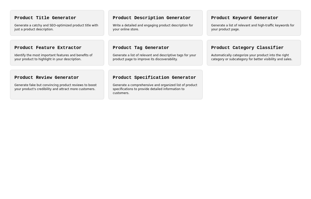
 Data Metrics Showcase
An information panel designed to instill trust, presenting vital statistics about a service or product. The grid layout offers a clean and organized look for displaying key data.
2 years ago8.7k -
 masonary grids effect for cards using columns
As part of the redesign I was trying to think of ways to lay out testimonials from students, which may have varying length/content, I stumbled onto the idea of using a masonry layout (think bricks, think Pinterest).
1 year ago1.3k -
 Blog post cards
responsive blog post cards
3 years ago12.8k


Explore components by Tags
Didn't find component you were looking for?
Search from 3000+ components