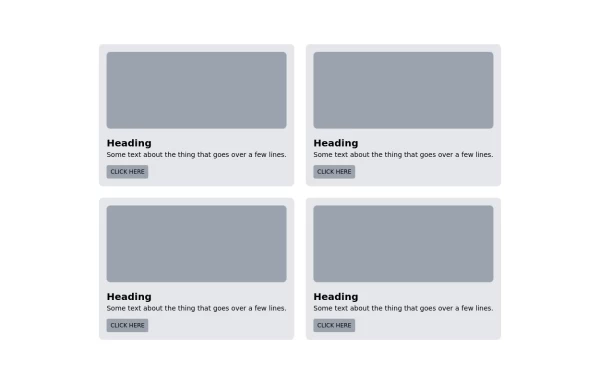
Grid (2x3)
This tailwind example is contributed by Maxim, on 01-Apr-2025. Component is made with Tailwind CSS v3. It is responsive.

Author Maxim
Related Examples
-
 Responsive Light Mode Footer Component
This is a fully responsive and reusable light-mode footer component designed by ABNahid Agency. Built with a clean structure and optimized for modern web applications, this footer features essential sections, including About, Services, Contact, and Social Links. Ideal for personal portfolios, business websites, or startup platforms—plug and play in your React or HTML project.
7 months ago588 -
 Feature overview cards
The component is designed to be responsive, featuring a title, a brief description, and a set of cards presenting key metrics.
2 years ago5.4k -
 Card KPI
Targetas ahora con un grafico
3 months ago676 -
 Information cards for admin panal
Stats cards
3 years ago10.8k -
 Tailwind responsive features card grid
with gradient background
2 years ago11.4k -
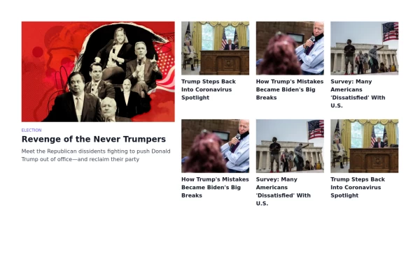 News website like card grid
fancy card grid
3 years ago14.3k -
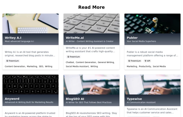 Posts / Articles card grid
Present a collection of articles or blog posts in a grid format with their respective featured images
2 years ago6.2k -
 2 years ago21.9k
 -
 3 years ago11.2k
 -
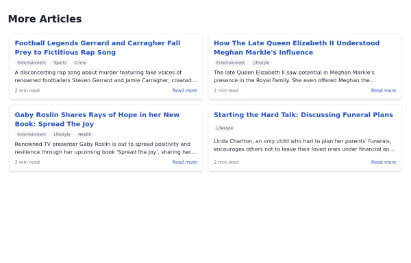 Article List Section
A section displaying a list of articles with associated information.
2 years ago7.3k -
 3 years ago24.4k
 -
 Responsive products grid
Responsive product card grid using tailwind CSS.
3 years ago44.9k


Explore components by Tags
Didn't find component you were looking for?
Search from 3000+ components