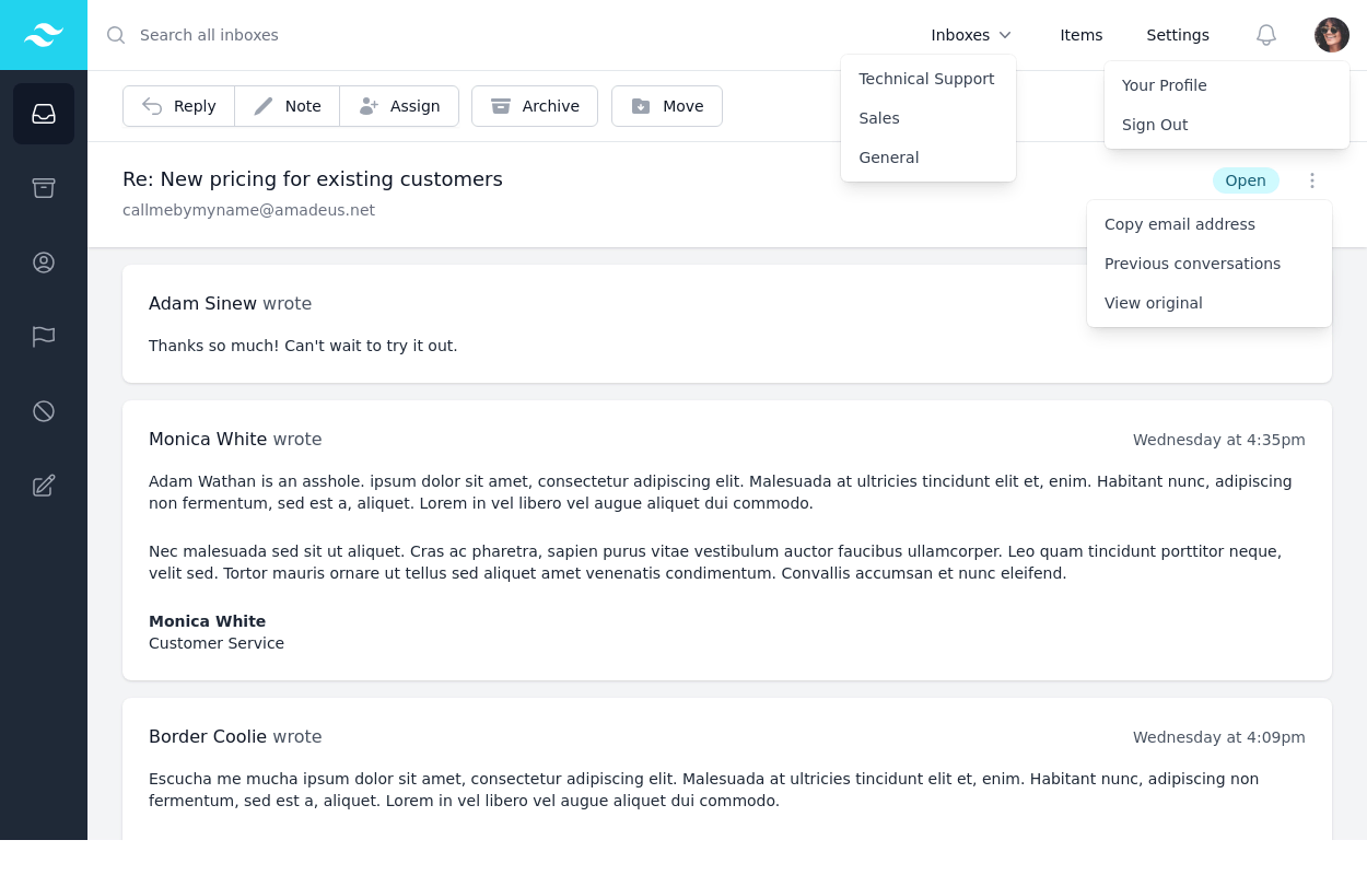
Boilerplate for Admin Panal
This tailwind example is contributed by Brandon D, on 29-Sep-2022. Component is made with Tailwind v3.4. similar terms for this example are Admin Dashboard, User dashboard

Related Examples
-
 Admin Panel
Source https://gist.github.com/visualval/8aaaad794256313fa2310b997e8a9b8f
25.7k -
 quora/reddit
reddit / quora have some kind of same template. looksalikes. brothas
13.6k -
-

-

-
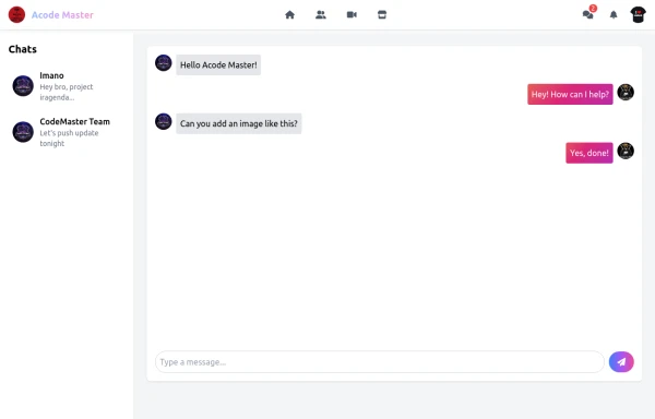 Acode Master - FB & WhatsApp UI Combo
Description (meta description) ni tag ikoreshwa mu mutwe (head) wa HTML igaragaza mu ncamake icyo urubuga cyangwa urupapuro rwawe ruvuga. Iyi description ikoreshwa cyane na search engines (nka Google) mu kwerekana summary y’urubuga mu bisubizo by’ubushakashatsi.
-
 KPI Cards
estilo Shopify / Stripe
-
 Order Management Data Table
A responsive order management table built with Tailwind CSS and DataTables. It includes a navigation bar, sortable data table, order progress indicators, file upload controls, and a footer. The component is suitable for admin dashboards, production workflows, and project tracking interfaces. Tags: Table, Data Table, Dashboard, Admin Panel, File Upload, Progress Bar, Responsive, Tailwind CSS
-
 Analytics dashboard with multiple chart types
Analytics Dashboard Comprehensive data insights and performance metrics
1.6k -
 High-Performance Hotel Operations & AI Agent Testing Dashboard
A sophisticated, real-time command center designed for modern hotel management. This dashboard features deep integration for monitoring AI agent performance, guest sentiment, and room occupancy. Built with a "Mobile-First" philosophy, it demonstrates advanced data visualization, glassmorphism UI design, and a centralized state-management architecture. Perfect for showcasing full-stack capabilities in AI-driven automation.
1.1k -
 Responsive Dashboard
1. Background Colors: 1. Main background: `bg-indigo-50` 2. Welcome card: `bg-indigo-100` with `border-indigo-200` 3. Inbox card: `bg-blue-100` with `border-blue-200` 4. Overlay: `bg-indigo-900/50` 2. Text Colors: 1. Header text: `text-indigo-800` 2. Logo: `text-blue-900` and `text-indigo-800` 3. Menu items hover: `hover:text-indigo-800` 4. Card headings: `text-blue-900` 3. Button/Badge Colors: 1. Welcome badge: `bg-indigo-800` 2. Inbox button: `bg-blue-800` with `hover:bg-blue-900` 3. Stats card titles: `text-indigo-800` 4. Maintained all functionality: 1. Responsive design 2. Animations and transitions 3. Mobile menu 4. Hover effects 5. Notification animation The color scheme now uses a mix of Indigo-800 and Blue-900 while maintaining visual hierarchy and accessibility. The colors create a professional and cohesive look across all components.
4.9k -
 Card KPI
Targetas ahora con un grafico




Browse by topic
Explore components by Tags
Jump straight to the UI pattern you need.
Can't find it?
Didn't find the component you were looking for?
Search across 3,000+ community-built components and grab the code in seconds.