pange
pejdz
This tailwind example is contributed by Anonymous, on 24-Nov-2023. Component is made with Tailwind CSS v3. It is responsive. similar terms for this example are Admin Dashboard, User dashboard

Author Anonymous
Related Examples
-
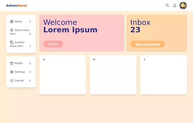
 Admin Panel
Source https://gist.github.com/visualval/8aaaad794256313fa2310b997e8a9b8f
3 years ago25.1k -
 quora/reddit
reddit / quora have some kind of same template. looksalikes. brothas
2 years ago12.9k -
 3 years ago15.1k
 -
 2 years ago13.5k
 -
 SPMB Dashboard - New Student Admission System
modern, luxurious, and elegant admin website dashboard
2 days ago28 -
 Admin Panel
Premium Admin Panel Pack including sidebar navigation, top navbar, dashboard. Fully responsive with modern clean design using Tailwind CSS.
8 months ago1.1k -
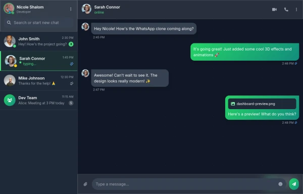 Best Chatting dashboard
create a modern WhatsApp-like chat dashboard with 3D effects, animations, and a sleek design. This will be a static view showcasing the interface with Nicole Shalom as the developer.
9 months ago1.2k -
 Analytics dashboard with multiple chart types
Analytics Dashboard Comprehensive data insights and performance metrics
3 weeks ago221 -
 Targeta
Targeta
3 months ago401 -
 Taskify Premium Task Management FREE
Website Task management modern and responsif
1 month ago167 -
 6 months ago818
 -
 Responsive Dashboard
1. Background Colors: 1. Main background: `bg-indigo-50` 2. Welcome card: `bg-indigo-100` with `border-indigo-200` 3. Inbox card: `bg-blue-100` with `border-blue-200` 4. Overlay: `bg-indigo-900/50` 2. Text Colors: 1. Header text: `text-indigo-800` 2. Logo: `text-blue-900` and `text-indigo-800` 3. Menu items hover: `hover:text-indigo-800` 4. Card headings: `text-blue-900` 3. Button/Badge Colors: 1. Welcome badge: `bg-indigo-800` 2. Inbox button: `bg-blue-800` with `hover:bg-blue-900` 3. Stats card titles: `text-indigo-800` 4. Maintained all functionality: 1. Responsive design 2. Animations and transitions 3. Mobile menu 4. Hover effects 5. Notification animation The color scheme now uses a mix of Indigo-800 and Blue-900 while maintaining visual hierarchy and accessibility. The colors create a professional and cohesive look across all components.
1 year ago4.5k


Explore components by Tags
Didn't find component you were looking for?
Search from 3000+ components