Login page
Login and register page, you can reuse both
This tailwind example is contributed by Abhiraj, on 26-Jan-2025. Component is made with Tailwind v3.4. It is responsive. It supports dark mode. similar terms for this example are CTA,banner,Register, Sign in

Related Examples
-
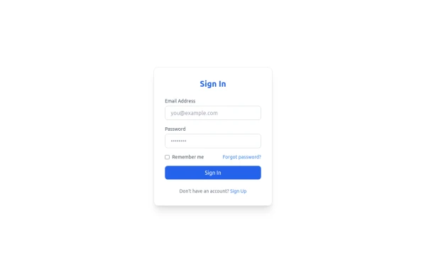 Sign In Form
Clean and modern Sign In form with email, password, and "Forgot password" link. Fully responsive and styled with Tailwind CSS, perfect for SaaS platforms.
1.3k -

-
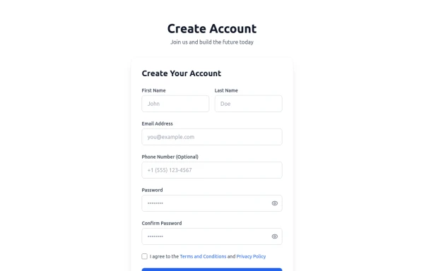 Registration Form with Validation & Success State
A modern and interactive registration form built using Tailwind CSS and Alpine.js, designed for seamless user onboarding with real-time validation and elegant animations. This component includes client-side form validation, dynamic password visibility toggles, and a success confirmation screen with personalized feedback. It’s fully responsive, dark mode–ready, and styled for modern SaaS or startup platforms. ✨ Key Features 🧠 Real-time input validation for required fields (name, email, password, etc.) 🔒 Show/hide password toggle with animated SVG icons ✅ Success message with user details after submission 💨 Animated transitions using Alpine.js 🌙 Dark mode and light mode compatible 📱 Fully responsive across all screen sizes 🧩 Built with pure Tailwind CSS and Alpine.js (no external libraries) 💡 Perfect for: Registration or sign-up pages SaaS onboarding flows Portfolio or agency login systems Form validation demos or UI component libraries
722 -
 Call to Action (for app stores)
Download app section with Playstore and Appstore button
12.3k -
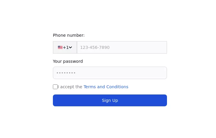 Authentication form
Use this example to authenticate users with a login form using a phone number instead of an email address.
3.8k -

-

-
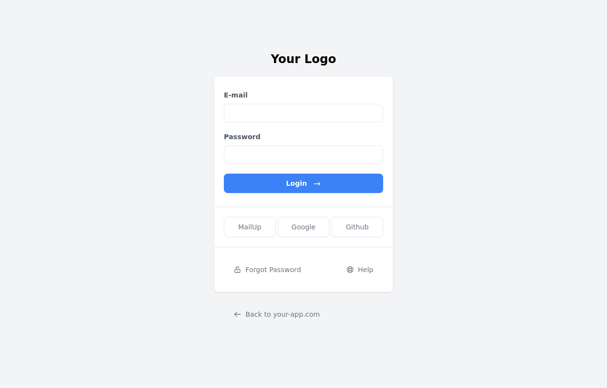
 login page
-
 login
login
1.4k -
-
 Registration Form
Color Updates: - Changed gradient background to `from-indigo-800 to-blue-900` - Updated text colors to `text-indigo-800` and `text-indigo-900` - Changed button colors to match the new theme - Updated focus rings to use indigo colors Enhanced Styling: - Added smooth transitions with `transition-all duration-300` - Improved shadow with `shadow-2xl` - Added hover scale effect on button - Increased border radius to `rounded-xl` - Added fade-in animation for the form Improved Validation: - Added visual feedback for invalid fields - Added input event listeners to clear error states - Added trim() to username and email validation - Added form reset after successful submission Accessibility Improvements: - Maintained proper contrast ratios - Kept focus states visible - Added proper spacing for better readability - Ensured all interactive elements are properly styled Added Interactions: - Smooth hover transitions - Scale animation on button hover - Immediate feedback on input - Clear error messaging
3.4k -
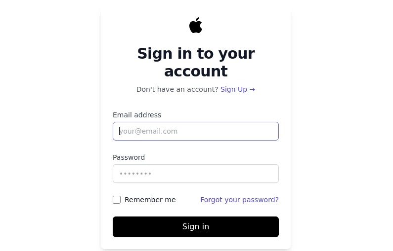 Sign-In Form with Tailwind CSS
Elegant sign in form
2.4k






Browse by topic
Explore components by Tags
Jump straight to the UI pattern you need.
Can't find it?
Didn't find the component you were looking for?
Search across 3,000+ community-built components and grab the code in seconds.