asimple game lay out
asimple game lay out
This tailwind example is contributed by Bonimater, on 05-Sep-2025. Component is made with Tailwind v3.4. It is responsive. similar terms for this example are CTA,banner

Related Examples
-
 Modern CTA section
CTA with background patterns
-

-
 Call to action (CTA) section
Modern and clean CTA section
12.5k -
 The Future of Web Development
love my product
-
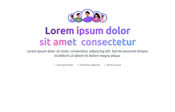 Animated Call-to-Action Section
Enhance your website with this , animated CTA section. Includes a gradient text animations, and a stylish avatar group. Easily customizable and designed to improve user engagement. Get the source code now.
761 -
 Tilted button on hover.
A simple button with a gradient and tilt on hover. Dark mode supported with same color.
1.8k -
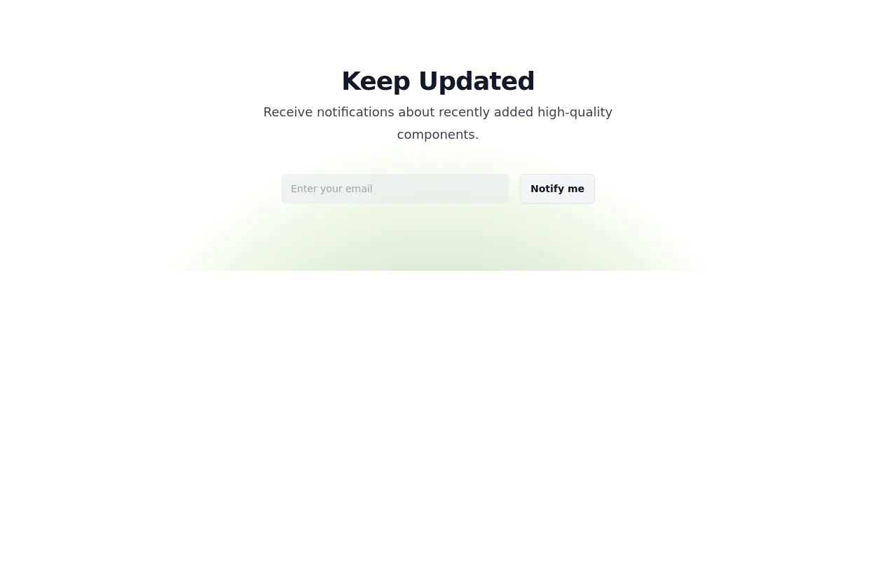 Newsletter Signup Form
It features a clean and modern design with a background illustration, making it visually appealing.
8.7k -

-

-
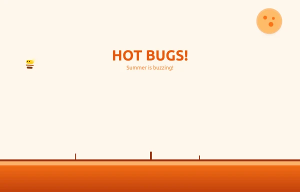 Bug Beach Day Heatwave
This playful animation brings sweltering summer insects to life with pure HTML and Tailwind CSS. Watch as: 🔥 Glowing Fireflies pulse with heat-radiant light, their wings shimmering in the desert sun 🐞 Overheated Ladybugs scuttle across cracked earth, their red shells reflecting the blazing heat ☀️ A Wobbling Sun dominates the sky, emitting pulsing heat waves across the animated landscape
1.7k -
 14.2k
14.2k -
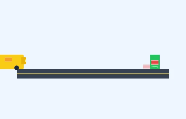 E-Commerce Delivery Truck Animation
This responsive CSS animation showcases a delivery bus transporting a package to its destination, created entirely with Tailwind CSS and pure HTML. The animation features
1.6k





Browse by topic
Explore components by Tags
Jump straight to the UI pattern you need.
Can't find it?
Didn't find the component you were looking for?
Search across 3,000+ community-built components and grab the code in seconds.