Basic CTA
Simple and straightforward call to action section
This tailwind example is contributed by Dipti narayan, on 06-Sep-2023. Component is made with Tailwind CSS v3. It is responsive. It supports dark mode. similar terms for this example are CTA,banner

Author Dipti narayan
Related Examples
-
 3 years ago10.4k
 -
 3 years ago13.4k
 -
 Promotion Block
It features a large, centered title, a brief description, and a prominent CTA button, all centered within a visually appealing layout.
2 years ago7.9k -
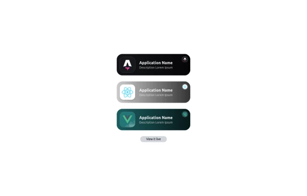 Applications Showcase
This is a stylish and interactive application showcase component designed for web use. It features the following elements: Background Styling: The main container has a rounded-rectangle shape (rounded-3xl) with a subtle white base overlaying a high-resolution background image, styled with background-size: 600px for an artistic touch. The image itself dynamically serves as a backdrop, giving the component a layered appearance. Main Icon: A small circular icon, located at the top-right corner, appears with smooth hover effects: Enlarges to double its size (scale-[2]). Rotates (rotate-[410deg]). Moves diagonally upwards-right (translate-x-3, -translate-y-3). These transitions occur over a duration of 1 second (transition duration-1000). Overlay Gradient: A transparent gradient overlay (bg-gradient-to-l) adds a polished depth effect, transitioning from black (from-black/80) to lighter shades. App Icon and Info: Icon: The app icon is a smaller, bordered square image (rounded-2xl) with hover shrink animations (group-hover:scale-95). Text: A bold application title (text-md font-semibold) with hover-animated underline effects that gradually expand from left to right. A short app description styled as secondary text. Call-to-Action Button: Below the card is a subtle, rounded button (rounded-full) encouraging interaction. It features: A hover effect with color inversion (gray to black). A lift effect (hover:-translate-y-1) when hovered. This component is perfect for modern app showcases, offering a dynamic, user-friendly visual experience. It ensures a professional look while engaging users through smooth animations and clear calls to action.
1 year ago2.8k -
-
 Hero section with a gradient background
With text overlay, and a call-to-action button
2 years ago20.3k -
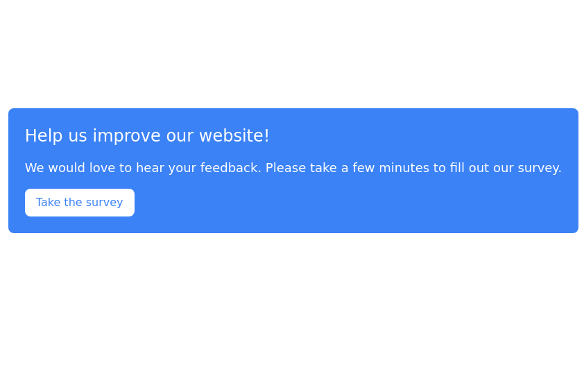
 CTA Call To Action
CTA stands for "Call to Action." It is a marketing term that refers to prompts that encourage users to take a specific action. CTAs are typically found in websites, advertisements, emails, and various marketing materials. The goal of a CTA is to guide users toward a desired action that supports business objectives, such as: 1. Encouraging Engagement: A CTA may prompt users to sign up for a newsletter, follow on social media, or download a resource. 2. Driving Conversion: It can lead users to make a purchase, book a service, or start a free trial. 3. Generating Leads: A CTA might encourage users to fill out a form, requesting more information or a consultation.
9 months ago850 -
 3 years ago10.3k
 -
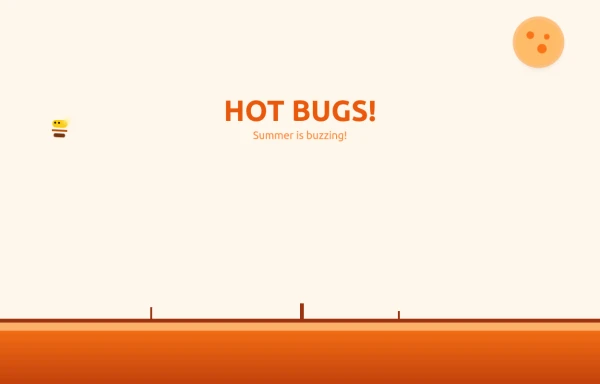 Bug Beach Day Heatwave
This playful animation brings sweltering summer insects to life with pure HTML and Tailwind CSS. Watch as: 🔥 Glowing Fireflies pulse with heat-radiant light, their wings shimmering in the desert sun 🐞 Overheated Ladybugs scuttle across cracked earth, their red shells reflecting the blazing heat ☀️ A Wobbling Sun dominates the sky, emitting pulsing heat waves across the animated landscape
9 months ago1.1k -
 1 year ago1.6k
 -
 3 years ago14.2k
 -
 CTA - Htmlwind
Screenshot on dark background
9 months ago1.1k


Explore components by Tags
Didn't find component you were looking for?
Search from 3000+ components