Survey CTA
This tailwind example is contributed by JaxStone, on 18-Jan-2023. Component is made with Tailwind CSS v3. It is responsive. similar terms for this example are CTA,banner

Author JaxStone
Related Examples
-
 Join Our Community Banner
Encourage users to become members of a community.
2 years ago8.6k -
 Call to action (CTA) section
Modern and clean CTA section
2 years ago11.9k -
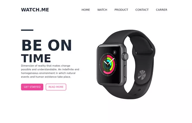 Product Page
Showcase for the product.
3 years ago33k -
 3 years ago10.4k
 -
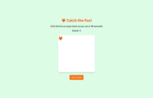 an off line game of catching afox
an off line game of catching afox
8 months ago785 -
 CTA Responsive
Gradient Style CTA
7 months ago553 -
 Beautiful CTA w/ large buttons
This CTA card also has a features list
1 year ago2.5k -
 2 years ago12.9k
 -
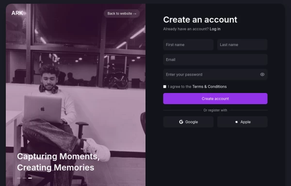 Login page
Login and register page, you can reuse both
1 year ago1.9k -
 CTA section with light beam from bottom effect
It also has support for dark mode
1 year ago2.1k -
 3 years ago10.9k
 -
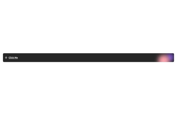 Free Animated Gradient Glow Button with Tailwind CSS
A modern, responsive Tailwind CSS button with glowing gradient hover effects, smooth animations, and an integrated SVG icon. Perfect for landing pages, call-to-action buttons, or any stylish UI project. Fully customizable and open source , ready to copy, paste, and use in your projects.
5 months ago376


Explore components by Tags
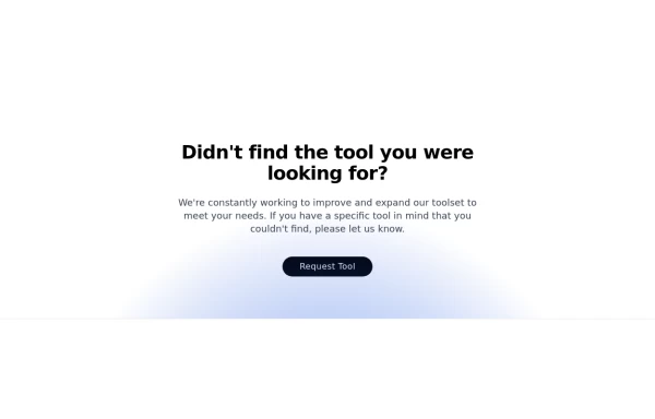
Didn't find component you were looking for?
Search from 3000+ components