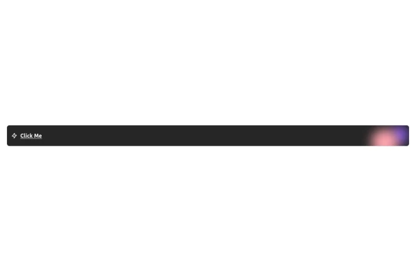
CTA card with gradient background
Grab users attention using this eye catching CTA card
This tailwind example is contributed by Emre Yılmaz, on 05-Feb-2024. Component is made with Tailwind CSS v3. It is responsive. It supports dark mode. similar terms for this example are CTA,banner

Author Emre Yılmaz
Related Examples
-

-
 2 years ago12.5k
 -
 Free Animated Gradient Glow Button with Tailwind CSS
A modern, responsive Tailwind CSS button with glowing gradient hover effects, smooth animations, and an integrated SVG icon. Perfect for landing pages, call-to-action buttons, or any stylish UI project. Fully customizable and open source , ready to copy, paste, and use in your projects.
5 months ago381 -
 11 months ago2k
 -
 3 years ago10.6k
 -
-
 11 months ago997
 -
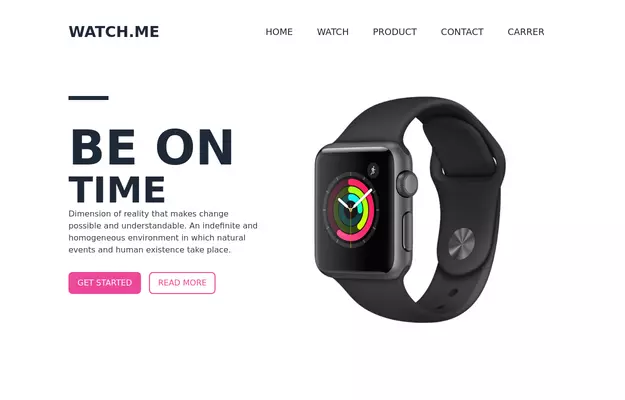 Product Page
Showcase for the product.
3 years ago33.1k -
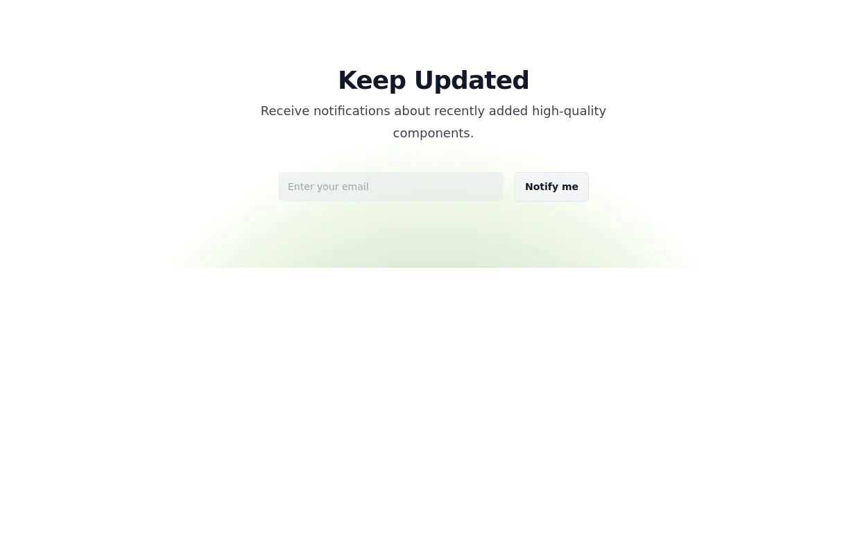 Newsletter Signup Form
It features a clean and modern design with a background illustration, making it visually appealing.
2 years ago8.1k -
 3 years ago11.1k
 -
 11 months ago2.3k
 -
 Hero Section
Full width hero section for landing pages
3 years ago13.9k


Explore components by Tags
Didn't find component you were looking for?
Search from 3000+ components