Bubblegum Button
This interactive button component is designed with a sleek gradient background and smooth hover effects, making it an eye-catching call-to-action element for modern web interfaces.
Styling and Features:
✅ Gradient Background & Rounded Shape
• The button container has a subtle gradient overlay (bg-gradient-to-tr) that smoothly transitions from soft pink (from-pink-300) to light blue (to-blue-300), giving it a vibrant and modern look.
• Wrapped in a rounded-full container for a pill-shaped aesthetic.
✅ Floating & Shadow Effects
• The shadow-lg property creates a soft floating effect, enhancing depth and visibility.
• Will-change-transform optimizes animations for a seamless hover experience.
✅ Interactive Hover Animations
• On hover, the inner button scales up (hover:scale-105) and lifts slightly (hover:-translate-y-2), simulating a press-and-release motion.
• The transition is smooth, with a 500ms animation (transition duration-500).
✅ Content & Icon
• The “Learn more” label is paired with a right-arrow icon (svg) for clear visual guidance.
• The icon and text are flex-aligned (items-center flex), ensuring a balanced and responsive layout.
This button is ideal for call-to-action elements, product highlights, or download prompts, offering a modern, sleek, and engaging user experience. 🚀
This tailwind example is contributed by Banshee, on 22-Jan-2025. Component is made with Tailwind CSS v3. It is responsive. similar terms for this example are CTA,banner

Author Banshee
Related Examples
-
 Call to Action (for app stores)
Download app section with Playstore and Appstore button
3 years ago11.8k -
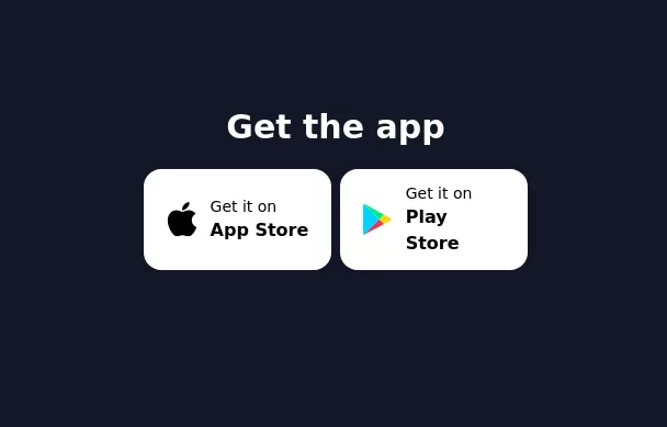 Get the app section
Play store and App store buttons
3 years ago9.7k -
 3 years ago10.1k
 -
2 years ago13.1k
-
Gradient Button
These buttons use a style that includes two contrasted colors creating an impressive mesh gradient effect.
2 years ago4.4k -
 Applications Showcase
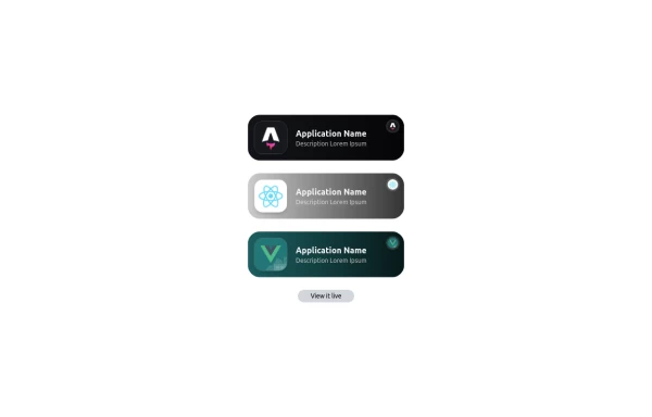
This is a stylish and interactive application showcase component designed for web use. It features the following elements: Background Styling: The main container has a rounded-rectangle shape (rounded-3xl) with a subtle white base overlaying a high-resolution background image, styled with background-size: 600px for an artistic touch. The image itself dynamically serves as a backdrop, giving the component a layered appearance. Main Icon: A small circular icon, located at the top-right corner, appears with smooth hover effects: Enlarges to double its size (scale-[2]). Rotates (rotate-[410deg]). Moves diagonally upwards-right (translate-x-3, -translate-y-3). These transitions occur over a duration of 1 second (transition duration-1000). Overlay Gradient: A transparent gradient overlay (bg-gradient-to-l) adds a polished depth effect, transitioning from black (from-black/80) to lighter shades. App Icon and Info: Icon: The app icon is a smaller, bordered square image (rounded-2xl) with hover shrink animations (group-hover:scale-95). Text: A bold application title (text-md font-semibold) with hover-animated underline effects that gradually expand from left to right. A short app description styled as secondary text. Call-to-Action Button: Below the card is a subtle, rounded button (rounded-full) encouraging interaction. It features: A hover effect with color inversion (gray to black). A lift effect (hover:-translate-y-1) when hovered. This component is perfect for modern app showcases, offering a dynamic, user-friendly visual experience. It ensures a professional look while engaging users through smooth animations and clear calls to action.
1 year ago2.8k -
 1 year ago1.9k
 -
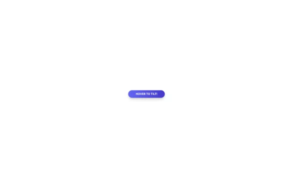
 Tilted button on hover.
A simple button with a gradient and tilt on hover. Dark mode supported with same color.
1 year ago1.3k -
 1 year ago2.4k
 -
 Tilted button on hover.
A simple button with a gradient and tilt on hover. Dark mode supported with same color.
1 year ago984 -
 Modern Dark Footer with Overlapping Gradient CTA
A comprehensive, dark-themed website footer component built with HTML and Tailwind CSS. It features a visually distinct overlapping section with a colorful gradient background containing a prominent call-to-action (CTA) block. The main footer area utilizes a multi-column grid layout for organized navigation links, a newsletter signup form, and social media icons. A final bottom bar includes legal links and copyright information. The design is responsive and adapts its layout for different screen sizes.
11 months ago1.1k -
 Tailwind CSS Button (Wavy Button)
The button uses Tailwind classes for size, background, border, border-radius, shadow, cursor, overflow, and transitions. The wave overlay is absolutely positioned at the bottom of the button, initially off-screen (top-full) and moves to the middle (top-1/2) on hover via the custom .wave class and keyframes. The font-poppins class isn’t a default Tailwind class. You should define it in your Tailwind configuration or replace it with font-sans if you haven't extended fonts.
9 months ago1k


Explore components by Tags
Didn't find component you were looking for?
Search from 3000+ components