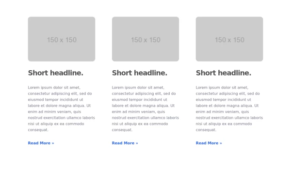
Responsive Tailwind CSS Listing Cards
This is a collection of responsive listing cards built with Tailwind CSS, optimized for modern web applications. The component features a flexbox layout, ensuring seamless responsiveness across mobile, tablet, and laptop screens. Each card includes an image, title, and description, styled for both light and dark modes. Perfect for showcasing products, portfolio items, or blog posts.
This tailwind example is contributed by Abhiraj, on 01-Jan-2025. Component is made with Tailwind CSS v3. It is responsive. similar terms for this example are Masonry, Image grid

Author Abhiraj
Related Examples
-
 3 years ago12.6k
 -
 Responsive Card Grid
Tailwind CSS responsive grid for feature listing. The cards have a teal background, rounded corners, and a concise display of feature titles, descriptions, and a "Learn More" link.
3 years ago52.1k -
 3 years ago13.5k
 -
 3 years ago16.7k
 -
 Products card grid
Example of product card grid with product image and pricing
3 years ago24k -
 Info cards
Show various statistics on your website
3 years ago11.6k -
 3 years ago24.2k
 -
 3 years ago10.2k
 -
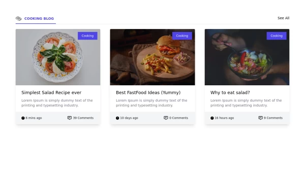
 Blog post cards
responsive blog post cards
3 years ago12.8k -
 3 years ago22.8k
 -
 Responsive card grid
responsive card grid for articles
3 years ago15.8k -
 Card grid section
Display article/blog grid
3 years ago29.5k


Explore components by Tags
Didn't find component you were looking for?
Search from 3000+ components