Card Component
This component is a simple card (without image) component with hover effect & Dark mode Supported & full responsive
This tailwind example is contributed by Shariar Hasan, on 15-Feb-2024. Component is made with Tailwind CSS v3. It is responsive. It supports dark mode.

Author Shariar Hasan
Related Examples
-
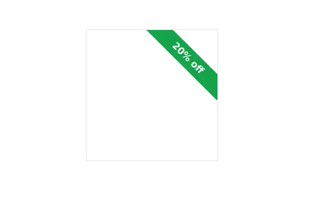
 Tour package card
This card could be used for featuring a product, service, or blog post:
1 year ago2.5k -
 Form
Formform
1 year ago2.1k -
 Tailwind image slider
slider with navigation buttons and info about image
2 years ago20.8k -
 payment card
A payment card is a type of card issued by a financial institution (like a bank) that allows the cardholder to make financial transactions. These transactions can include purchasing goods and services, withdrawing cash, or transferring money. Here’s a description based on the main types of payment cards:
9 months ago708 -
 3 years ago16.7k
 -
 3 years ago18.8k
 -
 1 month ago49
 -
 Tailwind Animated Login Form
A modern Tailwind CSS animated login form featuring smooth transitions, premium UI styling, responsive layout, and interactive input effects. Designed for admin panels, SaaS dashboards, and secure web applications, this login template delivers a clean light-theme interface with professional animations and a high-end user experience.
3 weeks ago231 -
 8 months ago1.1k
 -
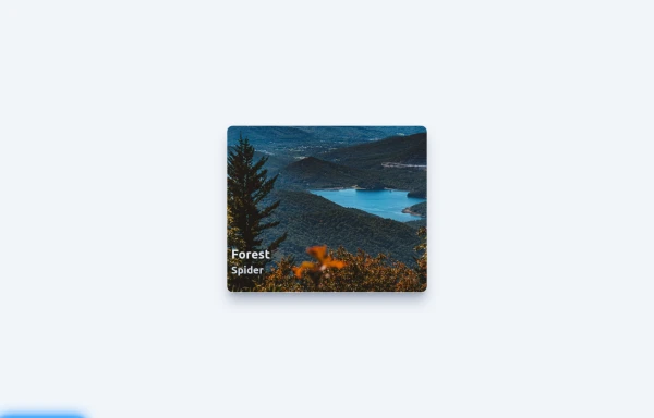
 myCard
card with image,title,body
1 year ago2.6k -
 Premium High-Performance Web Gaming Hub
Experience the future of browser-based gaming. I’ve developed a premium arcade hub designed for speed, clarity, and zero-latency gameplay. Built with modern web technologies, Ayyamperumal Games brings AAA-inspired visuals and high-octane mechanics directly to your browser—no downloads, no lag, just pure performance. Explore a curated library of titles ranging from minimalist logic puzzles like Sudoku Elite to fast-paced action in Neon Drift. This is where clean code meets high-level entertainment.
2 months ago286 -
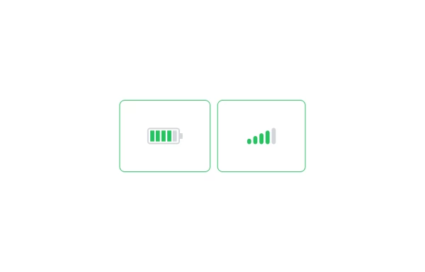 Battery and signal
Battery and signal bar component
1 year ago1k


Explore components by Tags
Didn't find component you were looking for?
Search from 3000+ components