htmlcss1
This tailwind example is contributed by Anonymous, on 22-Jun-2025. Component is made with Tailwind CSS v3. It is responsive.

Author Anonymous
Related Examples
-
 Hero Section
Responsive Hero Section for you Project Background Image: A stunning, high-quality Unsplash photo that creates a unique visual impact. Overlay: Semi-transparent black overlay with blur effect for readability and a modern aesthetic. Content Area: Centered with a gradient background overlay for contrast, bold headline, engaging subtext. Buttons: Vibrant gradient and clean border with smooth hover animations to draw attention. Responsive Design: Looks great on all screen sizes with adaptable padding and font sizes.
8 months ago1.5k -
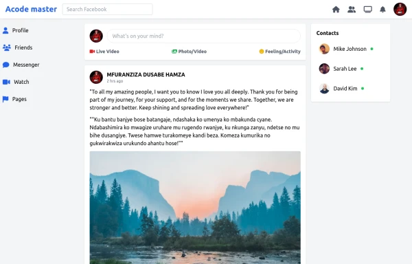 SocialSphere: A Full-Stack Social Media Platform
SocialSphere is a full-stack social media platform inspired by Facebook, built using HTML CSS
9 months ago866 -
 Elegant Dock
Useful Tailwind classes for constructing a basic Dock (usually used on mobile).
10 months ago908 -
 Live Chat Component using Tailwind Alpine JS
Live Chat Component using Tailwind Alpine JS
1 year ago729 -
 Track Your Order
Track Your Order
11 months ago528 -
 4 months ago511
 -
 Customer support chatbox
Floating chatbox
2 years ago11.7k -
 Frontend Template Open Source Code Website
This frontend template is designed for a website that provides software services and open-source code to users. It serves as a clean, modern UI for browsing, searching, and downloading open-source projects. Building with HTML, tailwindcss for CSS ,
8 months ago1.1k -
 Simple Hero Section
Hero Section using Tailwind
1 year ago1.4k -
 9 months ago616
 -
 Rwanda-Canada Transport Services | Safe & Reliable Shipping
Attractive color scheme inspired by Rwanda's landscapes
8 months ago660 -
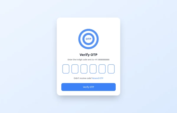 OTP Verification Page
A responsive and interactive OTP verification page built with Tailwind CSS. The page features a gradient background, hover effects, and animations to enhance user experience. It includes input fields for the OTP, a resend OTP link, and a verify button. The design is optimized for both light and dark modes.
1 year ago2.6k


Explore components by Tags
Didn't find component you were looking for?
Search from 3000+ components