Footer with Member info
Use below footer tailwind template which show number of member who joins the community.
This tailwind example is contributed by Pagedone, on 02-May-2024. Component is made with Tailwind CSS v3. It is responsive.

Author Pagedone
Related Examples
-
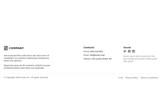 Responsive Footer
source: https://kitwind.io/products/kometa/components/footers
3 years ago16.8k -
 11 months ago1.2k
 -
 canvas fully covers
canvas fully covers
1 year ago4.4k -
 Website Pricing List Card Component
Website Pricing List Card Component with Package Names: Basic Package → Starter Website Premium Package → Business Website Professional Package → E-Commerce Solution Pricing Structure: Increased prices significantly to reflect web development services one-time payment model FAQ Content.
11 months ago1.5k -
 3 years ago10.9k
 -
 beautifull portfolio page
I create a portfolio page
1 year ago2.1k -
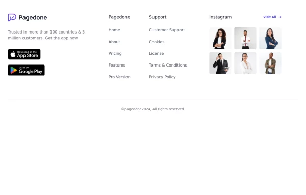 Footer with gallery
Use this example if you want to add gallery of images into your footer with brand logo, sitemap links and copyright notice.
1 year ago2.6k -
 Modern Website Header & Footer
I created a professional header and footer using HTML and Tailwind CSS with modern design elements, smooth animations, and interactive features.
9 months ago1.6k -
 Footer - Modern minimal style
clean and uncluttered, following a minimalist approach
2 years ago4.4k -
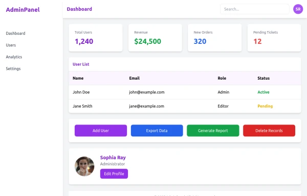 admin panel UI
Premium Admin Panel Pack including sidebar navigation, top navbar, dashboard cards, user tables, quick actions, profile section, and footer. Fully responsive with modern clean design using Tailwind CSS.
9 months ago1.9k -
 3 years ago11.5k
 -
 3 years ago11.7k


Explore components by Tags
Didn't find component you were looking for?
Search from 3000+ components