Animated button with rotating light beam
light beam rotates around the border
This tailwind example is contributed by Anonymous, on 29-Aug-2024. Component is made with Tailwind v3.4. It is responsive. It supports dark mode.

Related Examples
-
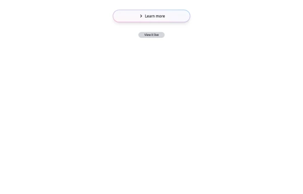 Bubblegum Button
This interactive button component is designed with a sleek gradient background and smooth hover effects, making it an eye-catching call-to-action element for modern web interfaces. Styling and Features: ✅ Gradient Background & Rounded Shape • The button container has a subtle gradient overlay (bg-gradient-to-tr) that smoothly transitions from soft pink (from-pink-300) to light blue (to-blue-300), giving it a vibrant and modern look. • Wrapped in a rounded-full container for a pill-shaped aesthetic. ✅ Floating & Shadow Effects • The shadow-lg property creates a soft floating effect, enhancing depth and visibility. • Will-change-transform optimizes animations for a seamless hover experience. ✅ Interactive Hover Animations • On hover, the inner button scales up (hover:scale-105) and lifts slightly (hover:-translate-y-2), simulating a press-and-release motion. • The transition is smooth, with a 500ms animation (transition duration-500). ✅ Content & Icon • The “Learn more” label is paired with a right-arrow icon (svg) for clear visual guidance. • The icon and text are flex-aligned (items-center flex), ensuring a balanced and responsive layout. This button is ideal for call-to-action elements, product highlights, or download prompts, offering a modern, sleek, and engaging user experience. 🚀
2k -
 Continue with Social Login - Continue with Google, LinkedIn, Twitter, Facebook, GitHub, Apple
Streamline your account creation and login process. Use our secure social login buttons to quickly sign in or register using your existing Google, LinkedIn, Twitter, Facebook, GitHub, or Apple account.
931 -
 Lots of button examples
tailwind button examples
1.3k -

-
Canlı Yayın Butonu
Pulse efekt içeren canlı yayın butonu.
2.5k -
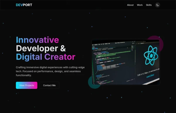 DevPort
modern portifolio by salvator
1.7k -
-
-
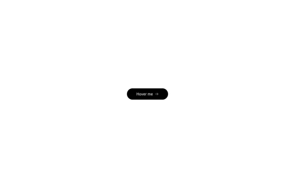 Button with hover effect
Button with light hover effect, responsive and suitable for light/dark mode.
898 -
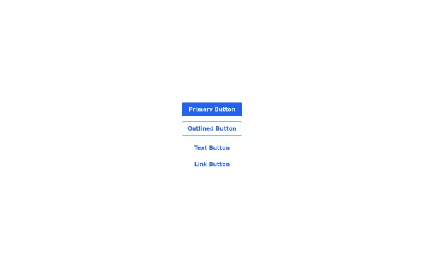 Buttons set
buttons sets of, primary, outlined, text and link
2.2k -
 less is more
 by salvator
1.6k






Browse by topic
Explore components by Tags
Jump straight to the UI pattern you need.
Can't find it?
Didn't find the component you were looking for?
Search across 3,000+ community-built components and grab the code in seconds.