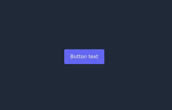
Animated Light/Dark Mode Toggle
👉🏻3D glow effects on knob & track 👉🏻Gradient transitions that look holographic 👉🏻Animated pulse when active 👉🏻Dark background gradient instead of a flat color 👉🏻Emoji swap (☀️ → 🌙)
This tailwind example is contributed by UI-Templates, on 13-Oct-2025. Component is made with Tailwind CSS v3. It is responsive. It supports dark mode. similar terms for this example is Transitions

Author UI-Templates
Related Examples
-
3 years ago14.6k
-
2 years ago13.1k
-
 Ripple Button
Ripple Button is an interactive button component with a ripple animation that responds to user clicks
2 years ago13.6k -
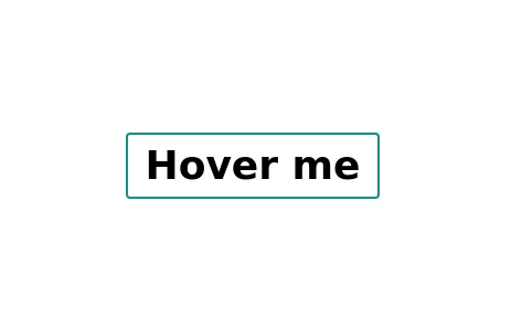
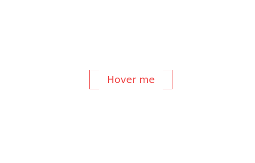 Botton hover
On hover Changes text
2 years ago7.1k -
Animated Gradient Background
animates a gradient background with vibrant colors. Slowly changes colors.
2 years ago27.2k -
Gradient Button
These buttons use a style that includes two contrasted colors creating an impressive mesh gradient effect.
2 years ago4.4k -
 Animated button
on hover underline will go from left to right
1 year ago5.5k -
 Hover effect card with background image
Beautiful card with background image, hover effect and gradient
1 year ago3.7k -
Button
Button When Hover and page Reload then Button text will show the animation
1 year ago2.8k -
Elevated Buton
On hover merge shadow
1 year ago2.6k -
Plug and Play Animated Button for Hero Statements / Landing Pages
REMOVE the bg-black from the outside <button/> div, if you are already using a black background. Besides this, the button is plug and play! Know errors: You may need to remove animate-spin for your usecase, depending on framework rendering. For SvelteKit, animate-spin is NOT needed. But the [animation:spin_4s]... is always necessary for a smooth effect. Check out my profile to join my community online or add me on LinkedIn.
1 year ago2k -
Canlı Yayın Butonu
Pulse efekt içeren canlı yayın butonu.
1 year ago1.9k


Explore components by Tags
Didn't find component you were looking for?
Search from 3000+ components