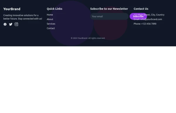
Newsletter Footer
Fully Responsive newsletter footer page
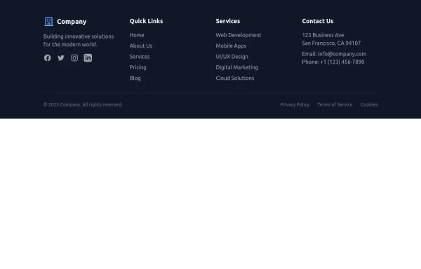
This tailwind example is contributed by AKASH GANDHAR, on 12-Jul-2024. Component is made with Tailwind CSS v3. It is responsive.

Author AKASH GANDHAR
Related Examples
-
 Footer
Simple Dark footer
7 months ago824 -
 beautifull portfolio page
I create a portfolio page
1 year ago2.1k -
 Footer for blog
https://github.com/tailwindow/component
3 years ago18.4k -
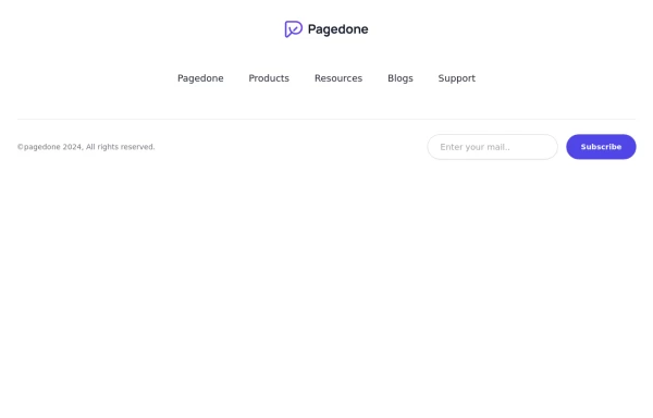 Centered footer with subscribe form
Use this example to center align everything in footer with brand logo, sitemap links and subscribe form.
1 year ago2.5k -
 1 year ago2.6k
 -
 Modern Responsive Footer with Tailwind CSS
This sleek and modern responsive footer is built using HTML and Tailwind CSS. It features three sections: brand information, useful links, and social media icons. The footer includes smooth hover effects, subtle fade-in animations, and a fully responsive design that adapts seamlessly to different screen sizes. Perfect for websites looking for a professional and stylish footer section.
1 year ago2k -
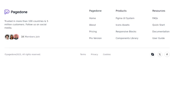 Footer with Member info
Use below footer tailwind template which show number of member who joins the community.
1 year ago2.3k -
 Website Pricing List Card Component
Website Pricing List Card Component with Package Names: Basic Package → Starter Website Premium Package → Business Website Professional Package → E-Commerce Solution Pricing Structure: Increased prices significantly to reflect web development services one-time payment model FAQ Content.
10 months ago1.5k -
 3 years ago10.9k
 -
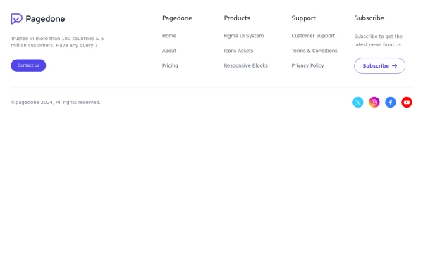 Five columns with subscribe button
This example of tailwind css footer can be used if you want five columns in your footer with brand logo, sitemap links, description and social media account with additional subscibe button to connect with your website.
1 year ago2.6k -
 10 months ago2.1k
 -
 Simple centered footer
Use this example for simple footer with horizontal sitemap links, brand logo, and social media accounts.This example can also be used as a tailwind sticky footer.
1 year ago3k


Explore components by Tags
Didn't find component you were looking for?
Search from 3000+ components