Payment form
This tailwind example is contributed by ORGIN_DREAMS, on 22-May-2025. Component is made with Tailwind v3.4. It is responsive. similar terms for this example are Service rates, Subscription plans

Related Examples
-
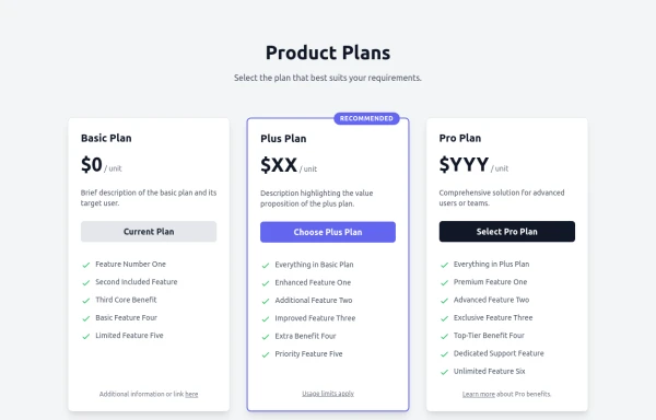 Responsive Multi-Tier Pricing Table Component
flexible and responsive 3-tier pricing table component built with HTML and Tailwind CSS. Features distinct visual styles for different plans (e.g., highlighting a recommended option), adapts to various screen sizes, and supports both light and dark color schemes. Uses generic placeholders for easy adaptation to any product or service.
2k -
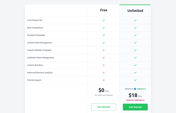 Comparison Pricing Table Component
A responsive pricing table built with HTML and Tailwind CSS, comparing two plans (Free and Unlimited) with a clear feature checklist. Includes distinct styling for the premium plan and a toggle for monthly/annual pricing display.
2.1k -
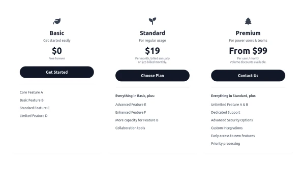 Responsive 3-Tier Pricing Card Section
A clean and responsive pricing table component featuring three distinct tiers (e.g., Basic, Standard, Premium) presented in a card layout. Built with HTML and Tailwind CSS, it stacks vertically on small screens and transitions to a side-by-side view on medium screens (md breakpoint - 768px) and up. Each plan card includes a placeholder icon, title, description, price details, a call-to-action button, and a bulleted list of features with checkmarks. The generic content makes it easy to adapt for various websites or applications needing a clear pricing comparison structure.
983 -
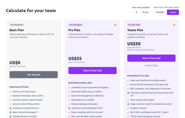 Configurable 3-Tier Responsive Pricing Table
A modern, responsive pricing table component inspired by SaaS layouts, built with HTML and Tailwind CSS. Features three distinct pricing tiers displayed in cards, stacking vertically on smaller screens and transitioning to a 3-column grid on large screens (lg breakpoint). Includes interactive top controls for selecting the number of users and toggling between monthly/yearly billing cycles. Each card uses placeholder content for icons, titles, descriptions, features (with checkmarks/info icons), and distinct call-to-action buttons, making it easily adaptable. Styled with subtle background colors and clear typography for excellent readability.
1.6k -
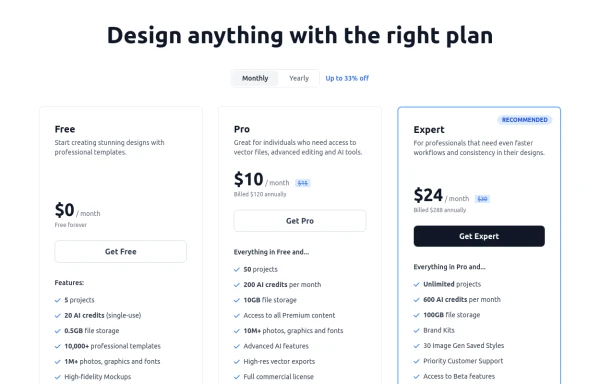 Modern Responsive Pricing Section with Toggle
A sleek, responsive pricing section built with HTML and Tailwind CSS, showcasing three distinct plans (e.g., Free, Pro, Expert) in a card layout. It features a clean monthly/yearly toggle switch with savings indication, highlights a recommended plan with distinct styling and a badge, and uses checkmarks for clear feature comparison. The layout stacks vertically on smaller screens and transitions to a 3-column grid on large screens (lg breakpoint). Includes generic content for easy adaptation and a final "Compare Plans" button.
1.8k -
 Pricing Plans
This plan offers access to all basic features, including unlimited projects and 24/7 support
1.1k -
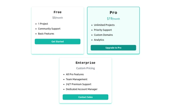 Card pricing section
Absolutely! Here's a beautiful 3-card pricing section using Tailwind CSS, with animations, dark mode support, and clearly differentiated plans (Free, Pro, and Enterprise).
1.3k -
 Attractive Feature Section
With Gradient Color 6 Features
1.4k -
 pricing
pricing
1.1k -
 634
634 -
 Interactive Multi-Method Donation Section
Overview: A high-trust, conversion-oriented fundraising section styled in the project's signature Navy Blue theme. It provides users with flexible payment options, ranging from one-click fixed amounts to manual bank transfers and cryptocurrency donations. Key Features: Smart Amount Logic: Includes a JavaScript-powered selector where users can choose a preset amount ($10, $25, $50) or type a custom value. The interface automatically toggles states (deselecting buttons when typing, and vice-versa) to prevent user error. Payment Methods: Quick Card/Checkout: Primary call-to-action column. Bank Transfer: A clean card displaying account details with a "Copy to Clipboard" utility. Crypto (Bitcoin): A specialized dark-themed card featuring a placeholder QR code and wallet address copying functionality. Trust Signals: Includes security iconography (lock, shield) and reassuring copy to boost donor confidence. Visual Hierarchy: Uses a 7/5 grid split to prioritize the immediate donation action while keeping manual payment methods accessible but secondary. Tech Stack: Framework: Tailwind CSS. Icons: Ionicons. Scripting: Vanilla JavaScript (for amount toggling and clipboard copying functions). Fonts: DM Serif Display (Headings) + Inter (Body). Usage: Ideal for the "Support Us" page or a dedicated campaign landing page. The script tag included at the bottom handles all the interactivity (button selection and text copying) without needing external libraries.
1.2k -
 Swiss-Grid Dark Pricing
A brutally minimalist pricing section that relies on strict grid architecture and typographic hierarchy instead of decorative elements. Features responsive border collapsing, monospaced technical accents, and high-performance CSS-only hover states. Designed for high-end SaaS, dev-tools, or agency portfolios that prioritize data clarity and structural rhythm.
827





Browse by topic
Explore components by Tags
Jump straight to the UI pattern you need.
Can't find it?
Didn't find the component you were looking for?
Search across 3,000+ community-built components and grab the code in seconds.