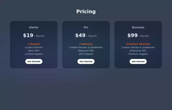
Pricing cards pair
This tailwind example is contributed by Samuel Dawson, on 25-Jan-2023. Component is made with Tailwind CSS v3. It is responsive. similar terms for this example are Service rates, Subscription plans

Author Samuel Dawson
Related Examples
-
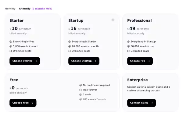
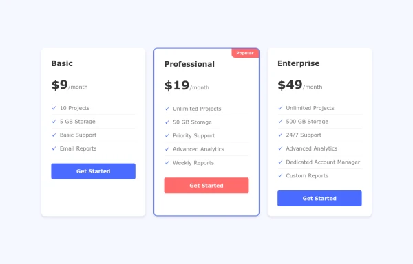
 Tiered Pricing Blocks
An organized way to compare different product offerings or pricing tiers. Users can quickly assess the features and pricing for various products.
2 years ago9.3k -
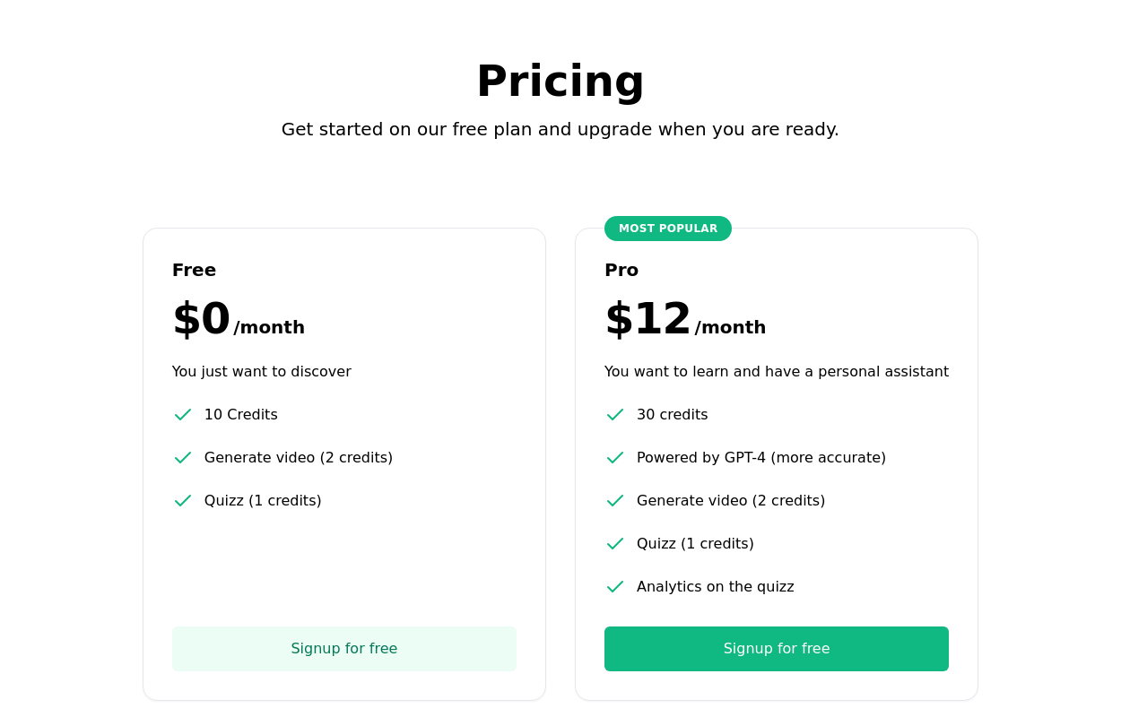
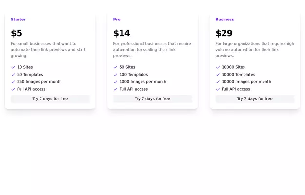
 Product Pricing Section
This component displays pricing plans for your product or service. It provides a clean and visually appealing layout for showcasing different pricing tiers with their respective features and prices.
2 years ago8.8k -
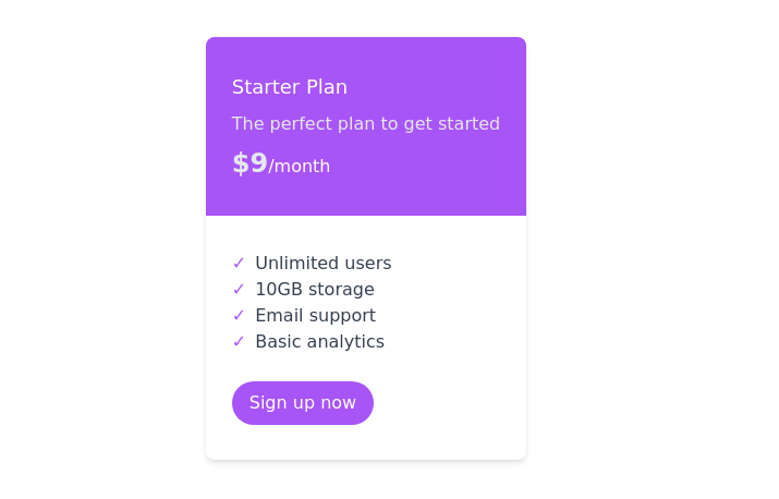
 Subscription Plan Cards
compare and choose between different subscription plans. It provides essential information such as plan name, price, features, and a signup button
2 years ago11.7k -
 3 years ago13.9k
 -
 2 years ago14.8k
 -
 4 weeks ago33
 -
 HighLight
Highlight section. Find it makecomponents.com
1 year ago2.1k -
 Animated Website
Welcome to our animated and engaging website built with Tailwind CSS. We provide top-notch web design, development, SEO, and consulting services to help your business grow.
8 months ago1.2k -
 2 years ago8.9k
 -
 Interactive Pricing Cards
this are pricing cards
8 months ago1k -
 Website Pricing List Card Component
Website Pricing List Card Component with Package Names: Basic Package → Starter Website Premium Package → Business Website Professional Package → E-Commerce Solution Pricing Structure: Increased prices significantly to reflect web development services one-time payment model FAQ Content.
10 months ago1.4k -
 3 years ago12.8k


Explore components by Tags
Didn't find component you were looking for?
Search from 3000+ components