HighLight
Highlight section. Find it makecomponents.com
This tailwind example is contributed by makecomponents, on 20-Aug-2024. Component is made with Tailwind CSS v3. It is responsive. similar terms for this example are Service rates, Subscription plans

Author makecomponents
Related Examples
-
 3 years ago11.1k
 -
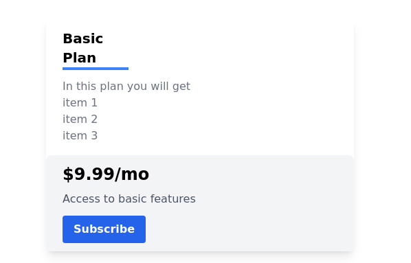 Pricing card
basic pricing card with single price
2 years ago10.9k -
 multiple pricing cards
basic pricing card with single price
2 years ago12.9k -
 Pricing card
Reveal details on hover
1 year ago4.6k -
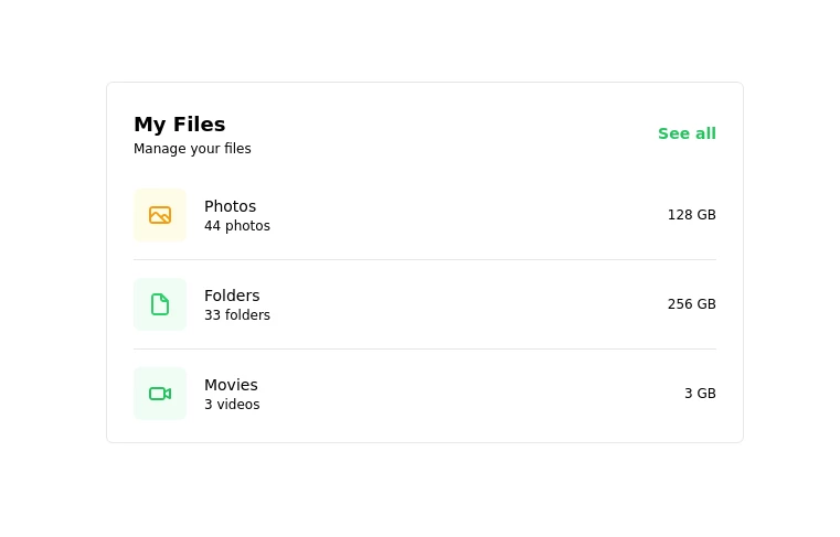 Card
CardCard
1 year ago2.6k -
 Card
CardCard
1 year ago1.8k -
 1 year ago1.7k
 -
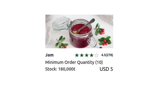
 Modern E-commerce Product Card with TailwindCSS
This product card is designed for e-commerce platforms using TailwindCSS. It features a discount badge, product image carousel, quick view and quick order buttons, ratings, product name, brand details, dynamic pricing with a strike-through original price, and a prominent add-to-cart button. The clean and professional layout is perfect for showcasing products on online stores.
1 year ago2.3k -
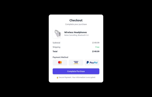 Checkout Card
A modern and responsive checkout card built with HTML & Tailwind CSS, featuring a clean UI, smooth shadows, and interactive hover effects. It includes secure payment options, a clear pricing breakdown, and adapts seamlessly to all screen sizes. Perfect for e-commerce and digital platforms to enhance user experience.
1 year ago1.5k -
 Website Pricing List Card Component
Website Pricing List Card Component with Package Names: Basic Package → Starter Website Premium Package → Business Website Professional Package → E-Commerce Solution Pricing Structure: Increased prices significantly to reflect web development services one-time payment model FAQ Content.
11 months ago1.5k -
 11 months ago1.1k
 -
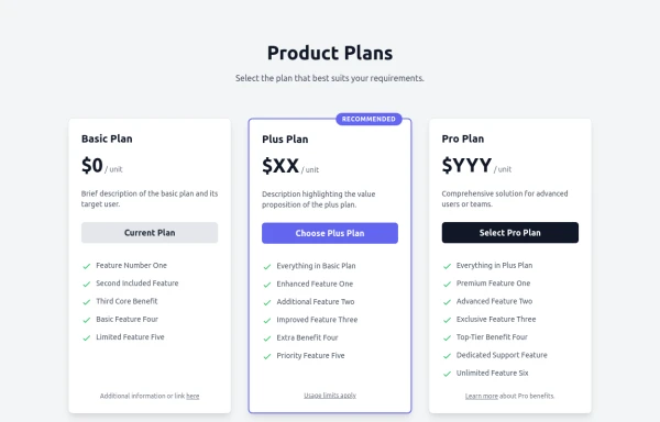 Responsive Multi-Tier Pricing Table Component
flexible and responsive 3-tier pricing table component built with HTML and Tailwind CSS. Features distinct visual styles for different plans (e.g., highlighting a recommended option), adapts to various screen sizes, and supports both light and dark color schemes. Uses generic placeholders for easy adaptation to any product or service.
11 months ago1.6k


Explore components by Tags
Didn't find component you were looking for?
Search from 3000+ components