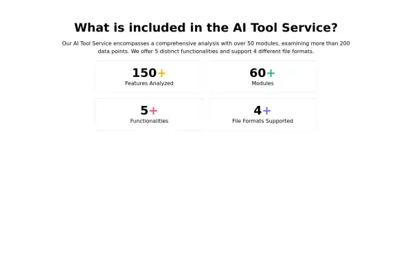
Info cards grid with icons
Evenly-sized cards for showing various stats on the user/admin dashboard.
This tailwind example is contributed by Prajwal Hallale, on 26-May-2023. Component is made with Tailwind CSS v3. It is responsive. similar terms for this example are Info, Show info, Statistics

Author Prajwal Hallale
Related Examples
-
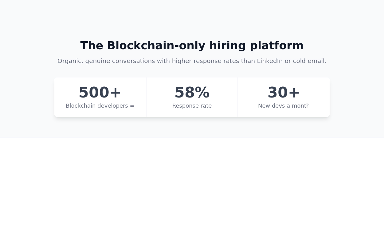 3 years ago18.1k
 -
 Data Metrics Showcase
An information panel designed to instill trust, presenting vital statistics about a service or product. The grid layout offers a clean and organized look for displaying key data.
2 years ago8.7k -
 Responsive Card Grid
Tailwind CSS responsive grid for feature listing. The cards have a teal background, rounded corners, and a concise display of feature titles, descriptions, and a "Learn More" link.
3 years ago52.4k -
 Info cards
Show various statistics on your website
3 years ago11.7k -
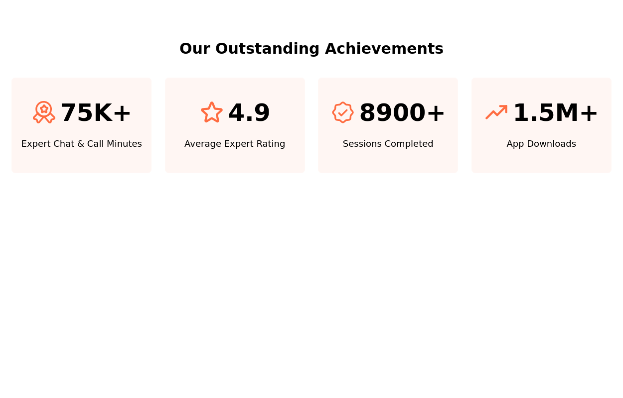 Stats Showcase
Tiles showcasing noteworthy achievements or metrics.
2 years ago9.8k -
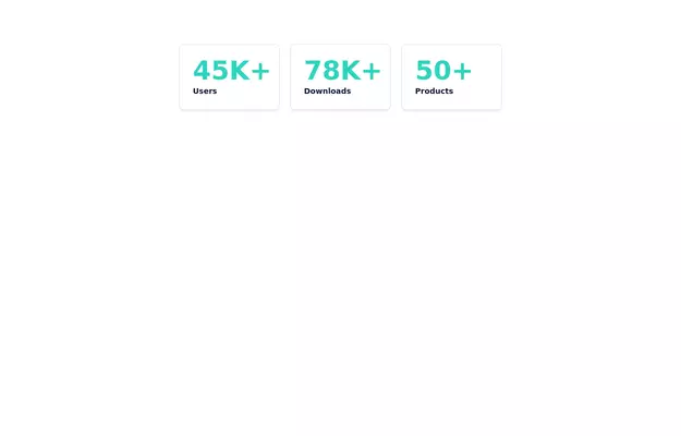
 Responsive products grid
Responsive product card grid using tailwind CSS.
3 years ago45k -
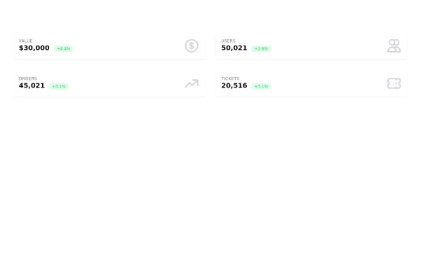 Information cards for admin panal
Stats cards
3 years ago10.8k -
 Stats cards for admin panel
This Component is designed to present statistics in a tile format. It comprises a title, a large numeric value, and an icon, creating an eye-catching way to display data.
2 years ago6.9k -
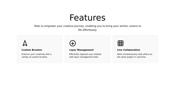
 Feature overview cards
The component is designed to be responsive, featuring a title, a brief description, and a set of cards presenting key metrics.
2 years ago5.5k -
 1 year ago1.7k
 -
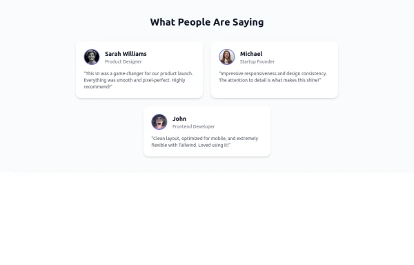 Tailwind Flex Component: Responsive Testimonial Section UI
A clean, modern, and fully responsive Testimonial Section built using Tailwind CSS and Flexbox. Ideal for portfolios, agency websites, SaaS landing pages, or any modern UI project. This reusable component includes user images, job titles, and quotes—perfect for showcasing feedback and adding trust to your UI.
9 months ago1.1k -
 2 years ago3k


Explore components by Tags
Didn't find component you were looking for?
Search from 3000+ components