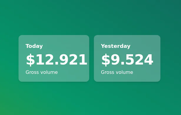
Info cards
This tailwind example is contributed by Lukas Müller, on 13-Feb-2023. Component is made with Tailwind v3.4. It is responsive. similar terms for this example are Info, Show info, Statistics

Related Examples
-

-

-
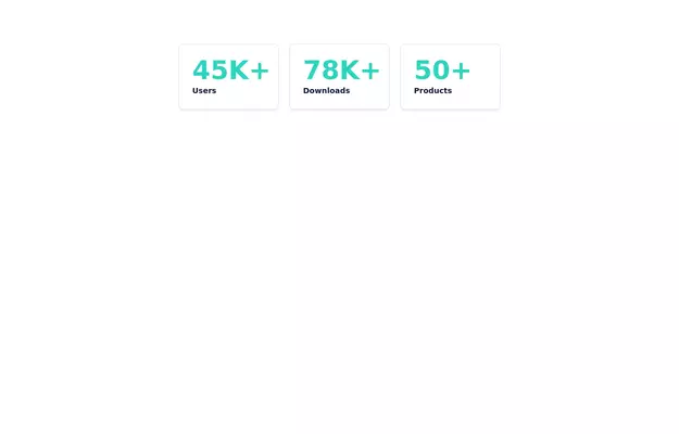 Info cards
Show various statistics on your website
12k -
-
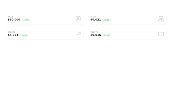 Information cards for admin panal
Stats cards
11.2k -
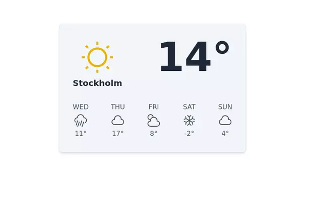 Weather info Card
Inspired from Mamba UI
12.7k -
-
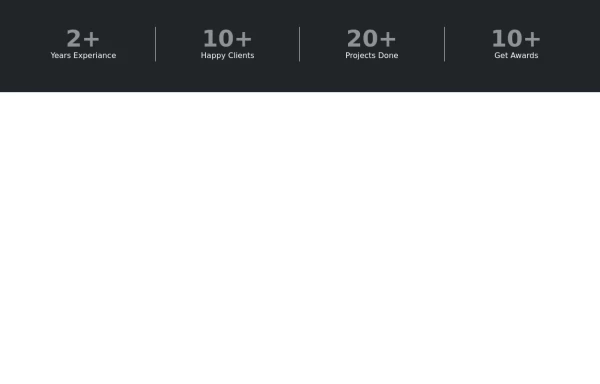 Stats or Metrics Overview
Highlight your achievements with our Stats Section, featuring key metrics such as years of experience, happy clients, completed projects, and awards. This visually engaging component effectively communicates your expertise and success at a glance
1.8k -
 How does it work Steps example
Dark themed steps section
8.7k -
-
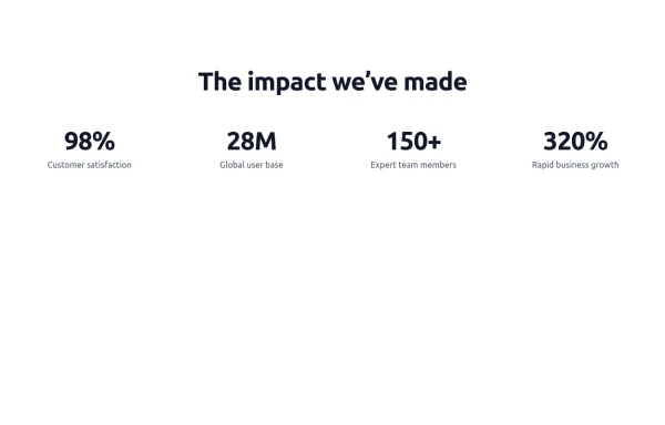 Stats - Htmlwind
Simple stats
1.6k -




Browse by topic
Explore components by Tags
Jump straight to the UI pattern you need.
Can't find it?
Didn't find the component you were looking for?
Search across 3,000+ community-built components and grab the code in seconds.