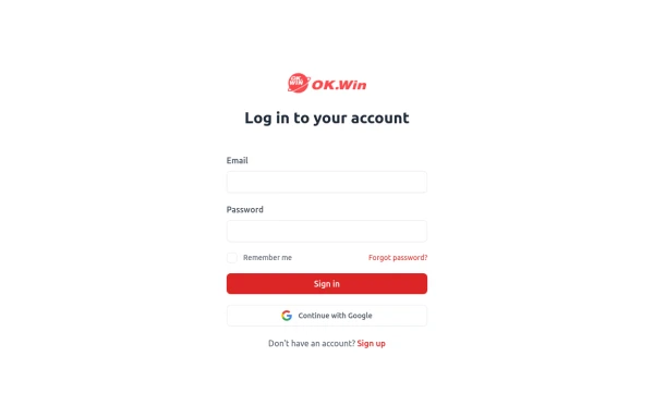
Sign in form
includes Google login button
This tailwind example is contributed by Paul Intay, on 29-Feb-2024. Component is made with Tailwind CSS v3. It is responsive. It supports dark mode. similar terms for this example are Register, Sign in

Author Paul Intay
Related Examples
-
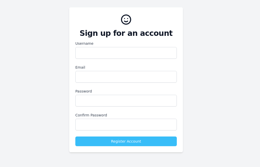
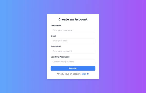 Responsive Registration Page
I created a responsive and visually appealing registration page using TailwindCSS and HTML5. This page features a gradient background, a modern card-style form, and clear input fields for username, email, password, and password confirmation. It includes client-side validation with real-time error messages to ensure all required fields are filled correctly and passwords match. This form is designed to provide a seamless user experience across all devices.
1 year ago3.3k -
 1 year ago1.4k
 -
 3 years ago24.7k
 -
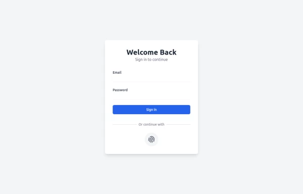
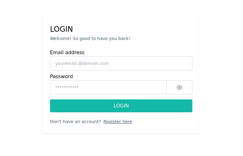 Login Form Component
The "Login Form Component" is a visually appealing and user-friendly interface designed for user authentication. It features a clean and well-structured layout with fields for entering the email address and password.
2 years ago8.4k -
 login!!!!
html , css
10 months ago1.3k -
 2 years ago2.6k
 -
 9 months ago771
 -
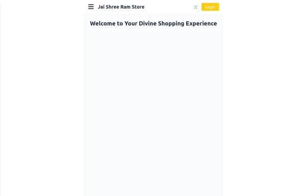 Responsive eCommerce Sidebar Layout with Hamburger Menu | Tailwind CSS UI for Online Stores
Build a clean and responsive eCommerce sidebar layout with a smooth hamburger menu using Tailwind CSS and Alpine.js. Ideal for devotional, spiritual, or modern online stores. Includes dark mode support, navigation links, cart, login, and a dynamic layout for beautiful product pages.
10 months ago1.1k -
 1 year ago1.8k
 -
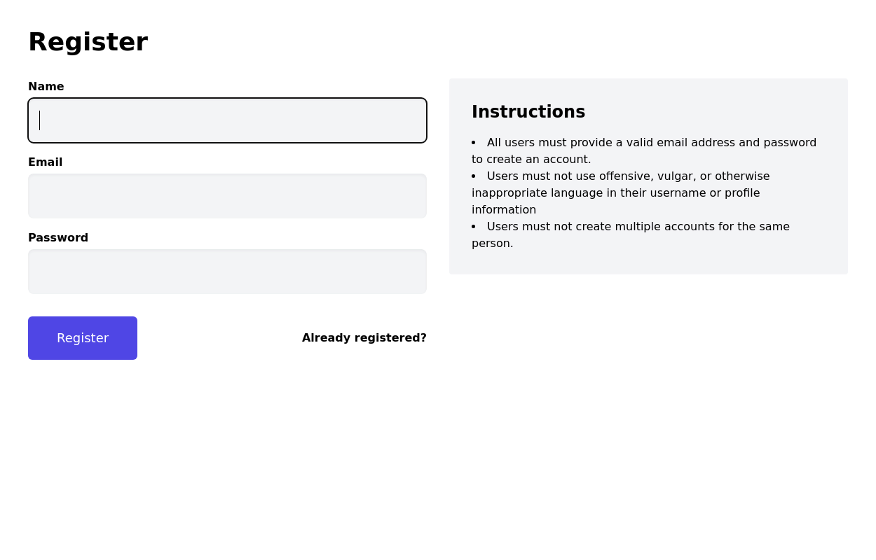
 Login Form
Color Updates: - Changed background to gradient `from-indigo-800 to-blue-900` - Updated text colors to match the new theme - Updated button and interactive element colors - Added dark mode color variants Enhanced Styling: - Added gradient background - Increased padding and spacing - Improved border radius to `rounded-xl` - Added hover scale effects - Enhanced shadow with `shadow-2xl` Added Animations: - Fade-in animation on load - Scale transition on card hover - Button ripple effect on click - Smooth transitions for all interactive elements Improved Dark Mode: - Enhanced dark mode colors - Added system preference detection - Improved dark mode contrast - Added dark mode specific focus rings Enhanced Functionality: - Added basic form validation - Added ripple effect on button click - Improved hover and focus states - Added transition animations Accessibility Improvements: - Maintained proper contrast ratios - Enhanced focus states - Added proper ARIA attributes - Improved form labels
1 year ago2.2k -
 Sign up form
simple full-height register form
3 years ago13.1k -
 Responsive registration form
form with social login buttons
2 years ago29.3k


Explore components by Tags
Didn't find component you were looking for?
Search from 3000+ components