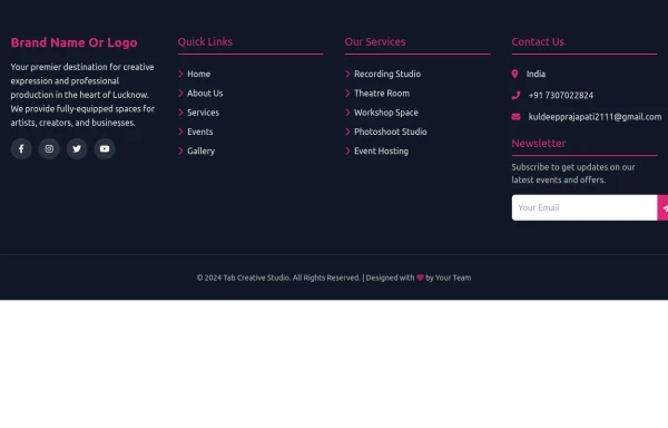
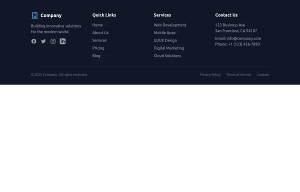
Responsive Footer Section
This modern and responsive footer adapts seamlessly to all screen sizes, ensuring a clean and organized layout. It includes essential navigation links, contact details, and a subscription form, all structured for easy access. Using display: contents;, the design remains flexible and visually balanced, enhancing the user experience across devices.
This tailwind example is contributed by ABDO-SY, on 30-Mar-2025. Component is made with Tailwind CSS v3. It is responsive.

Author ABDO-SY
Related Examples
-
 Footer
A footer is a critical part of any professional website. A footer ensures your website is complete, professional, user-friendly, and legally compliant. It's where users go for answers when they're done scrolling.
8 months ago1k -
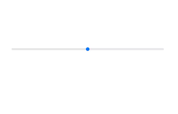
 Multi Range Slider
Adjust the sliders to set your preferred price range. The left slider sets the minimum price, and the right slider sets the maximum price. The selected range is displayed below the sliders in real-time, allowing you to easily filter products within your budget.
1 year ago1.9k -
 3 years ago14.2k
 -
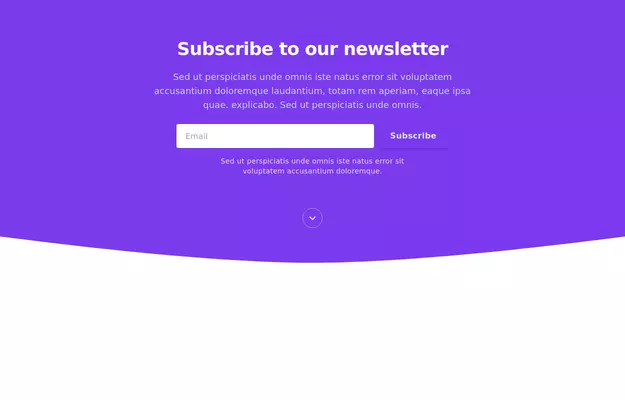
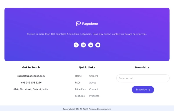 Newsletter with address location
Use this example to first show brand logo card, then show address locations of your company, a newsletter sign-up form.
1 year ago3k -
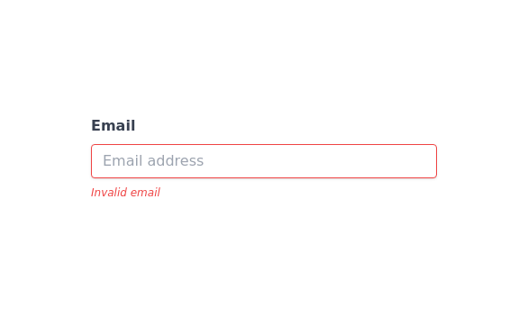 Invalid input detected message
incorrect input notification
2 years ago12.6k -
 10 months ago2.1k
 -
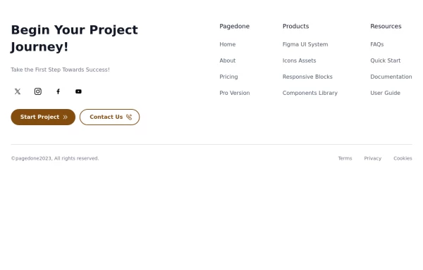 Creative with CTA buttons
Use Below tailwind css footer example with CTA buttons and site links.
1 year ago2.5k -
 3 years ago11.6k
 -
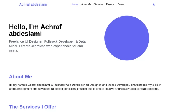 Responsive portfolio with dark mode
responsive and support dark mode .portfolio website
1 year ago3.8k -
 3 years ago12.7k
 -
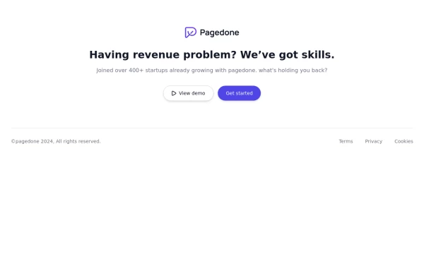 Centered footer with CTA
Use this Tailwind CSS footer compoent for simple footer with center aligned everything and with CTA buttons.
1 year ago2.1k -
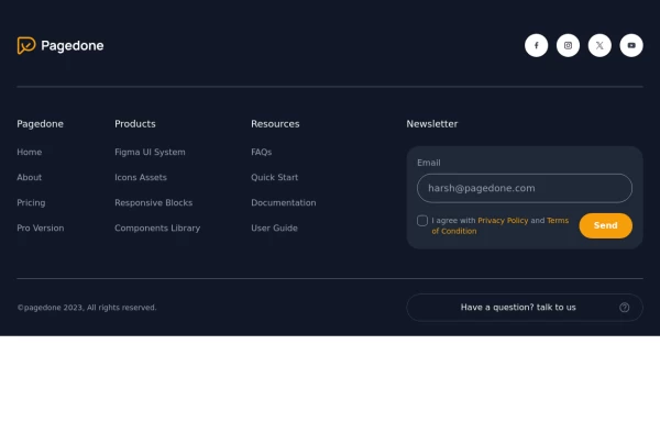 Dark Footer with newsletter
Use Following Footer for dark vsersion of your website with newsletter, social icons and site links.
1 year ago3k


Explore components by Tags
Didn't find component you were looking for?
Search from 3000+ components