Creative with CTA buttons
Use Below tailwind css footer example with CTA buttons and site links.
This tailwind example is contributed by Pagedone, on 02-May-2024. Component is made with Tailwind CSS v3. It is responsive.

Author Pagedone
Related Examples
-
 Website Pricing List Card Component
Website Pricing List Card Component with Package Names: Basic Package → Starter Website Premium Package → Business Website Professional Package → E-Commerce Solution Pricing Structure: Increased prices significantly to reflect web development services one-time payment model FAQ Content.
10 months ago1.5k -
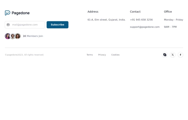
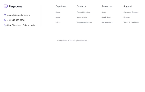 Four columns with address location
You can use this Tailwind Footer example to first show address location of your company with brand logo next to sitemap links.
1 year ago2.7k -
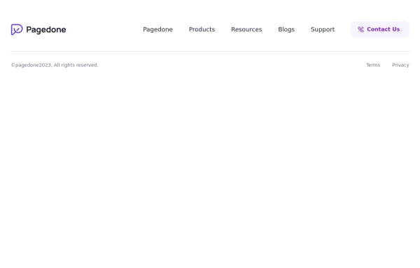 Simple footer with CTA Button
You can use this simple footer as a base for any type of websites. It includes a single CTAs button that you can customize according to your requirement.
1 year ago2.1k -
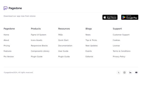 Footer with App buttons
This example can be used if you want add your app buttons of store for download with brand logo, sitemap links and social media accounts.
1 year ago2.7k -
 Premium High-Performance Web Gaming Hub
Experience the future of browser-based gaming. I’ve developed a premium arcade hub designed for speed, clarity, and zero-latency gameplay. Built with modern web technologies, Ayyamperumal Games brings AAA-inspired visuals and high-octane mechanics directly to your browser—no downloads, no lag, just pure performance. Explore a curated library of titles ranging from minimalist logic puzzles like Sudoku Elite to fast-paced action in Neon Drift. This is where clean code meets high-level entertainment.
1 month ago272 -
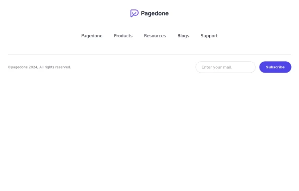 Centered footer with subscribe form
Use this example to center align everything in footer with brand logo, sitemap links and subscribe form.
1 year ago2.5k -
 Home page
Home page для ПО, страница для входа в приложение.
1 year ago1.3k -
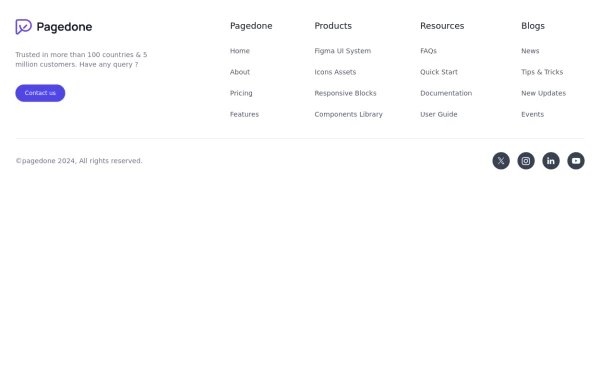 Default Tailwind Footer
Use this example of a footer section divided in five columns with brand logo, desciption, sitemap links and social media accounts.
1 year ago3k -
 Responsive eCommerce Footer Component with Tailwind CSS
A modern, fully responsive eCommerce footer component built with Tailwind CSS. It includes multiple sections like company info, account links, help center, categories, social media icons, payment methods, and app download buttons. Optimized for seamless mobile and desktop experiences, making it perfect for any online store or business website.
1 year ago1.2k -
 Simple tailwind footer
Simple tailwind footer with newsletter
3 years ago10.3k -
 home page
Hero Section: Gradient background with noise texture Animated floating image Gradient text effect Call-to-action buttons Features Section: Three feature cards with gradient headers Hover animations Clean iconography Stats Display: Full-width gradient background Clean stat presentation Testimonials: Three testimonial cards with user avatars Star ratings Border accents Hover scaling effects Call-to-Action (CTA) Section: Gradient background Centered content Multiple action buttons Footer: Four-column layout Social media icons Newsletter signup Copyright information Design Features: Vibrant gradient color scheme Smooth hover animations and transitions Responsive layout for all screen sizes Modern typography Subtle floating animations Clean, card-based design
9 months ago1.1k -
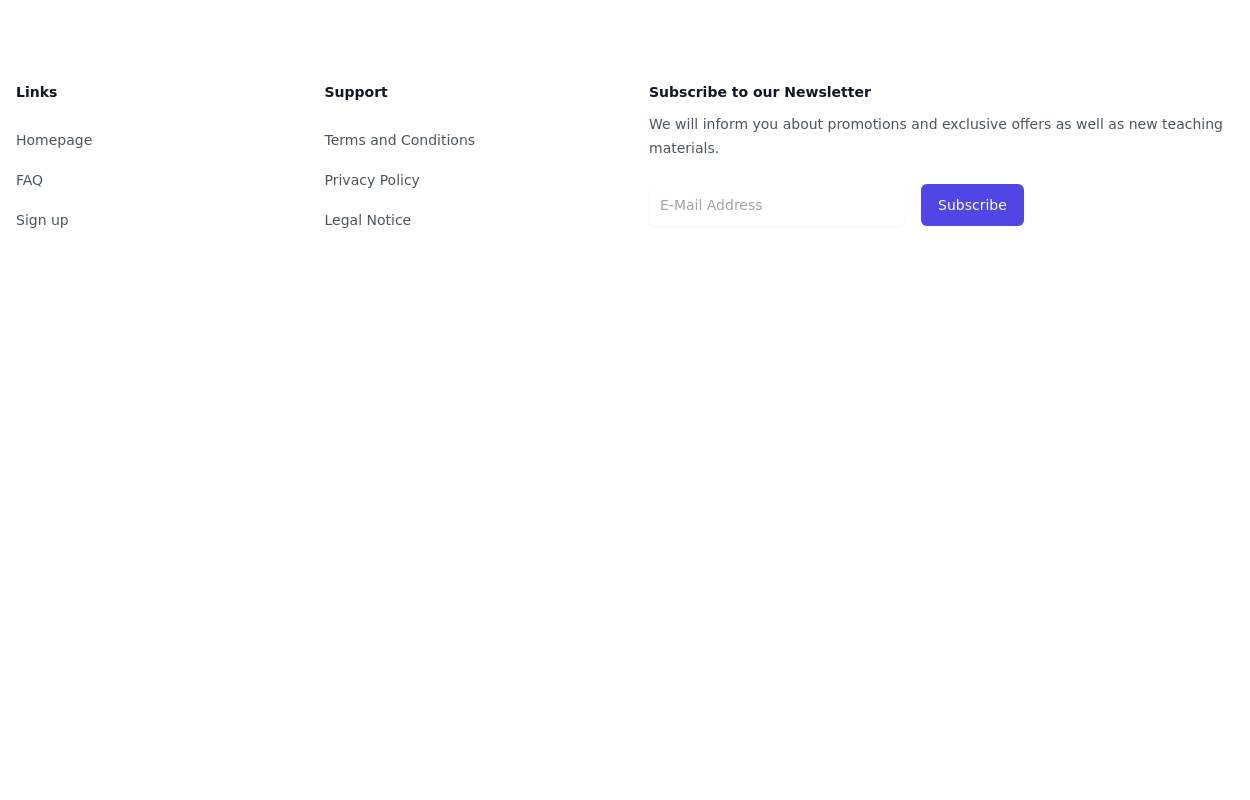
 subscribe form in Footer
You can use following subscribe form in your tailwind footer section beside contact information such as email address, phone numbers etc and You can also shows community counts.
1 year ago3k


Explore components by Tags
Didn't find component you were looking for?
Search from 3000+ components