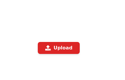
Gold Premium Button
🪙 Glowing Premium BIP Gold Button in pue Tailwind CSS
This tailwind example is contributed by Arnav K, on 23-Jan-2024. Component is made with Tailwind CSS v3. It is responsive. It supports dark mode.

Author Arnav K
Related Examples
-
![Material 3 Buttons [Light]](https://tailwindflex.com/storage/thumbnails/material-3-buttons-light/canvas.min.webp?v=18) Material 3 Buttons [Light]
Material 3 Buttons [Light]Buttons that conform to Google's Material 3 design guidelines
9 months ago1k -
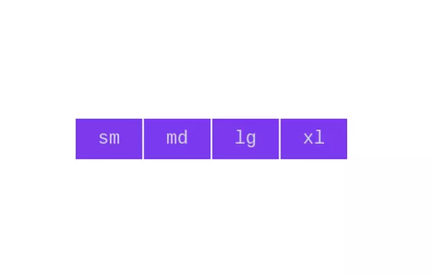 Button group
Add active class to clicked button using JavaScript
3 years ago10.8k -
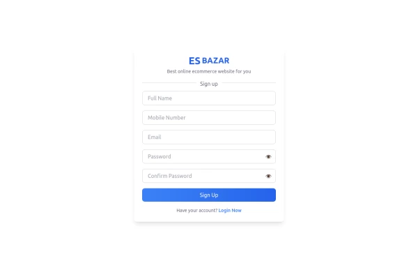 Responsive Sign-Up Form with TailwindCSS
Create a visually appealing and fully responsive sign-up form using TailwindCSS. This form includes input fields for full name, mobile number, email, password, and confirm password, along with a gradient sign-up button. Designed with simplicity and flexibility, it is perfect for modern web applications and easy to integrate into any project.
1 year ago1.5k -
 2 years ago16.6k
 -
 2 years ago8.7k
 -
 3 years ago17.6k
 -
 3 years ago12.7k
 -
 3 years ago10.3k
 -
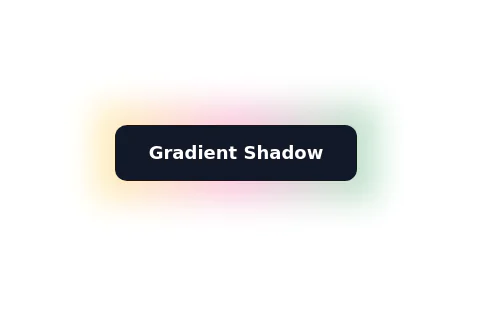
Color Changing Gradient Button
Color Changing Gradient Button
1 year ago3.7k -
 Neo-Brutalism UI Button Collection - Bold CSS Button Styles withTailwind CSS
Bold, chunky neo-brutalism buttons with thick borders and strong shadows for modern web design. Explore our collection of vibrant, high-contrast CSS buttons with hover effects and dark mode support.
3 months ago501 -
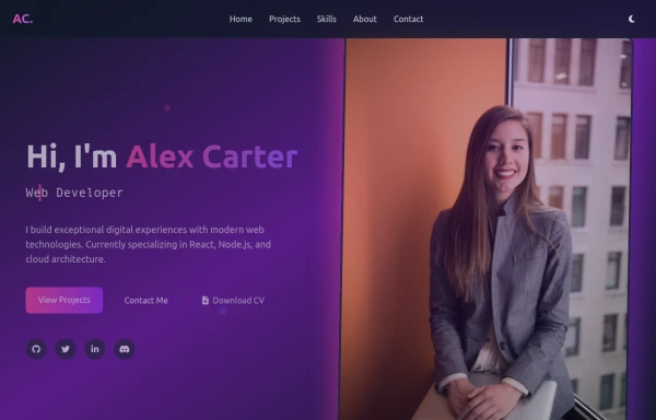 modern portifolio
by salvator
9 months ago827 -
Dark mode toggle button
Switch to dark mode without any hassle with this simple JavaScript hack. Sun night button
2 years ago21.6k


Explore components by Tags
Didn't find component you were looking for?
Search from 3000+ components