Floating feedback button
This tailwind example is contributed by Livia Flores, on 22-Feb-2023. Component is made with Tailwind v3.4. It is responsive.

Related Examples
-
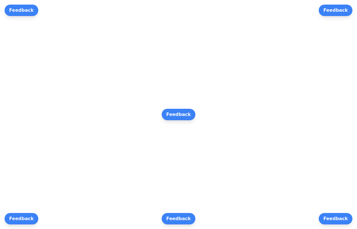 Floating buttons examples
Bottom-Right Corner, Bottom-Left Corner, Top-Left Corner, Top-Right Corner, Center, Bottom-Center
26.4k -

-
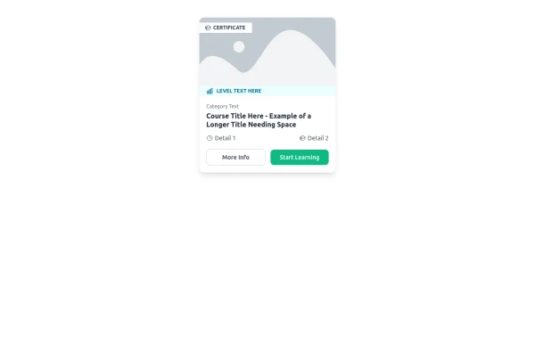 E-Learning Course Card with Badge and Level Indicator
An HTML and Tailwind CSS component mockup for displaying course information. Features include a placeholder image area with an overlaid certificate badge, a distinct level indicator banner below the image, category text, a course title, key details (like duration and learner count placeholders), and primary/secondary action buttons. Designed for e-learning platforms or course listings.
1.6k -
Continue with Discord button
Login with the Discord button for social login
3.6k -
 Button with hover to button shadow
A beautiful button with a special shadow
1.9k -
 Button with hover effect
Button with light hover effect, responsive and suitable for light/dark mode.
896 -
 Exapnd and collapse button for large content without javascript
Truncate and expand on click large content without using JavaScript.
2.7k -
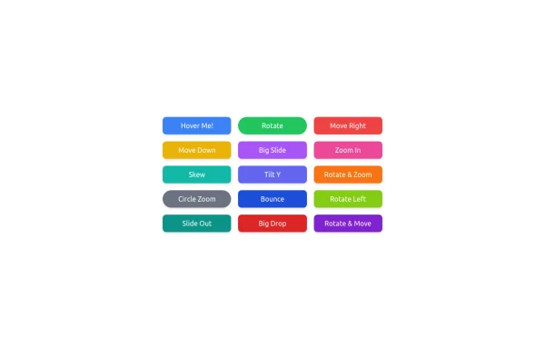 button animation
button animation big
1.5k -
-

-
 hero modern
hero modern
839






Browse by topic
Explore components by Tags
Jump straight to the UI pattern you need.
Can't find it?
Didn't find the component you were looking for?
Search across 3,000+ community-built components and grab the code in seconds.