Download on the App Store dark button
This tailwind example is contributed by Simon Scheffer, on 12-Mar-2023. Component is made with Tailwind CSS v3.

Author Simon Scheffer
Related Examples
-
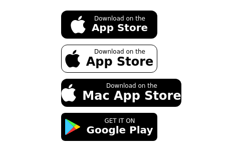 Store buttons (apple,google play)
apple, google play store buttons
3 years ago15k -
 Playstore Button
Download on the play store button
3 years ago14.8k -
 3 years ago10.7k
 -
 1 year ago2.7k
 -
 Ripple Button
Ripple Button is an interactive button component with a ripple animation that responds to user clicks
2 years ago13.3k -
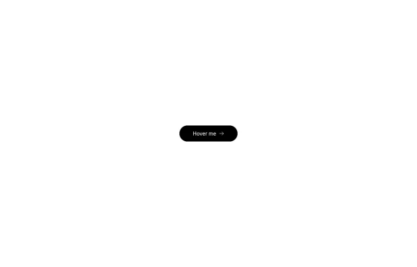 Button with hover effect
Button with light hover effect, responsive and suitable for light/dark mode.
4 months ago341 -
Color Changing Gradient Button
Color Changing Gradient Button
1 year ago3.5k -
 3 years ago16.5k
 -
3 years ago19.5k
-
Hover Button
Hover button then a overlay came from bottom to top
1 year ago2.2k -
 1 year ago3.2k
 -
 2 years ago11.3k


Explore components by Tags
Didn't find component you were looking for?
Search from 3000+ components