Gallery
Gallery
This tailwind example is contributed by Aman kumar, on 28-Jun-2024. Component is made with Tailwind CSS v3. It is responsive. similar terms for this example are Masonry, Image grid

Author Aman kumar
Related Examples
-
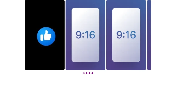
 responsive slider carousel
slider carousel
1 year ago2.3k -
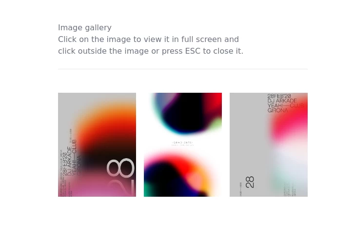
 image gallery
image gallery [lightbox]
2 years ago20.3k -
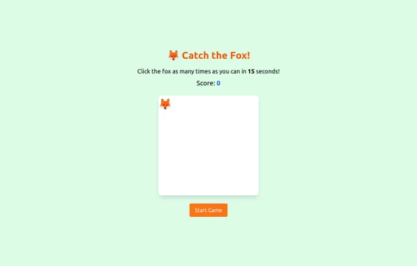 an off line game of catching afox
an off line game of catching afox
9 months ago785 -
 Galerie Interactive
Galerie Interactive
1 month ago62 -
 slider /carousel
simple slider or carousel
10 months ago1.2k -
-
 gallery
gallery by css
10 months ago1.1k -
 9 months ago1.3k
 -
 1 year ago5.3k
 -
 Gallery
Masonry Grid
1 year ago3.4k -
 "Visit Rwanda" tourism website focusing on wildlife, particularly mountain gorillas
Key Features of This Rwanda Tourism Website: Focus on Mountain Gorillas ("Ingagi"): Dedicated section highlighting gorilla trekking experiences Information about conservation efforts Booking options for gorilla permits Wildlife Showcase: Featured animals including gorillas, golden monkeys, elephants, lions, and more Beautiful image cards for each species Conservation-focused messaging National Parks Information: Sections on Volcanoes, Akagera, and Nyungwe National Parks Visual highlights of each park's unique features User Experience: Responsive design that works on all devices Attractive color scheme inspired by Rwanda's landscapes Easy navigation with clear calls-to-action Practical Information: Contact form for tour inquiries Testimonials from previous visitors Footer with important links and contact details
8 months ago756 -
 ULTIMATE SNAKE
(click to https://quantum-snake.netlify.app/ )ULTIMATE SNAKE is a modern reimagining of the classic Snake game, blending retro gameplay with enhanced visuals, power-ups, and a dynamic difficulty system. Designed for both casual players and high-score chasers, this game brings nostalgia and excitement in every move.
9 months ago915


Explore components by Tags
Didn't find component you were looking for?
Search from 3000+ components