Sticky sidebar menu for big screens
This tailwind example is contributed by Prajwal Hallale, on 07-May-2023. Component is made with Tailwind CSS v3. It is responsive. similar terms for this example is drawer

Author Prajwal Hallale
Related Examples
-
 2 years ago57.4k
 -
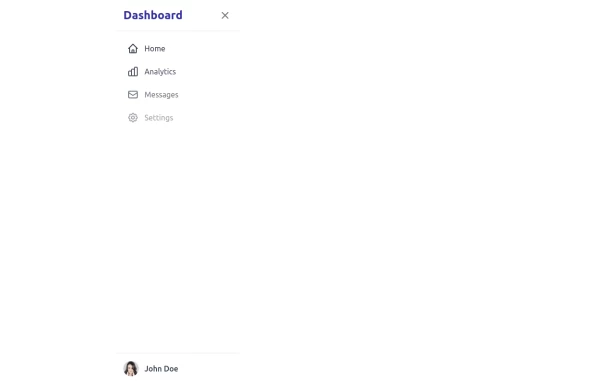
Animated Drawer
Collapsible sidebar navigation that allows users to access additional menu options. It is designed for efficient space utilization and can be easily expanded and collapsed.
1 year ago25k -
 2 years ago14.6k
 -
 Responsive navbar with dark mode support
Sidebar on small screen devices
2 years ago17.4k -
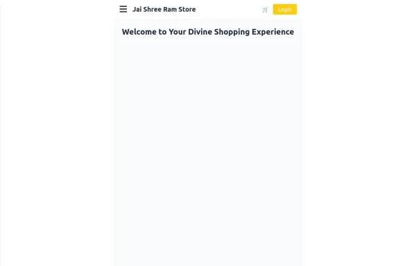 Responsive eCommerce Sidebar Layout with Hamburger Menu | Tailwind CSS UI for Online Stores
Build a clean and responsive eCommerce sidebar layout with a smooth hamburger menu using Tailwind CSS and Alpine.js. Ideal for devotional, spiritual, or modern online stores. Includes dark mode support, navigation links, cart, login, and a dynamic layout for beautiful product pages.
2 weeks ago92 -
 1 year ago6.2k
 -
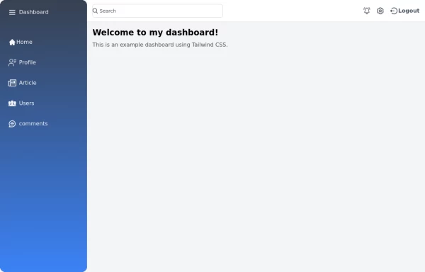
 Sidebar
This is the sidebar that I use in my projects, I use grid to be able to manage the space issue a little better, it seems like a clean and modern design, it is more than anything for the dashboards that you want to create
6 months ago2.6k -
 Tailwind Sidebar Layout (improved)
Improved Tailwind Sidebar Layout. - Responsive sidebar working - Close responsive sidebar working - Positioning menu-toggle correctly - Added some fresh icons - Added sub-items - showing on click - Added animation and swap on icons using 'peer'
6 months ago2.3k -
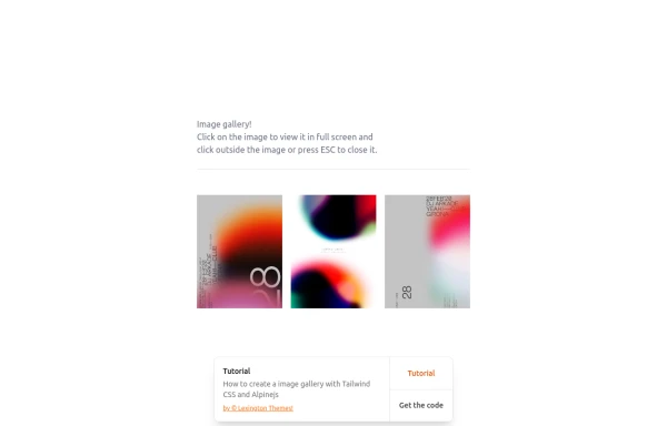 gallary
html , css
3 weeks ago126 -
 sidebar
This sidebar implementation includes: 1. Responsive design that works on both desktop and mobile 2. Indigo-800 and Blue-900 color scheme for the background 3. Dark mode support 4. Beautiful animations and effects: 1. Slide-in animation when opening the sidebar 2. Fade-in animation for menu items with staggered delays 3. Hover effects on menu items with underline animation 4. Smooth color transitions 5. SVG icons for menu items 6. User profile section at the bottom of the sidebar 7. Close button for easy dismissal on mobile 8. Main content area with a toggle button for the sidebar 9. Accessibility considerations (proper heading structure, color contrast, focus styles) Key features: - The background uses a gradient from Indigo-800 to Blue-900 - The sidebar has a white background in light mode and dark gray in dark mode - Text colors are adjusted for readability in both light and dark modes - Menu items have hover effects with background color changes and underline animations - Icons change color on hover - The sidebar slides in from the left with a smooth animation - Menu items fade in with a staggered delay for a smooth entrance - Dark mode is automatically applied based on system preferences - The layout is responsive, with the sidebar hiding off-screen on mobile and a toggle button to show/hide it This implementation provides a visually appealing and functional sidebar with various animations and effects, using HTML, Tailwind CSS, and vanilla JavaScript for the interactions.
7 months ago2.9k -
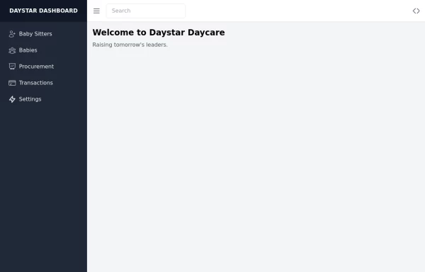 Daystar Day care Dashboard
Daystar Day care Dashboard
1 year ago8.3k -
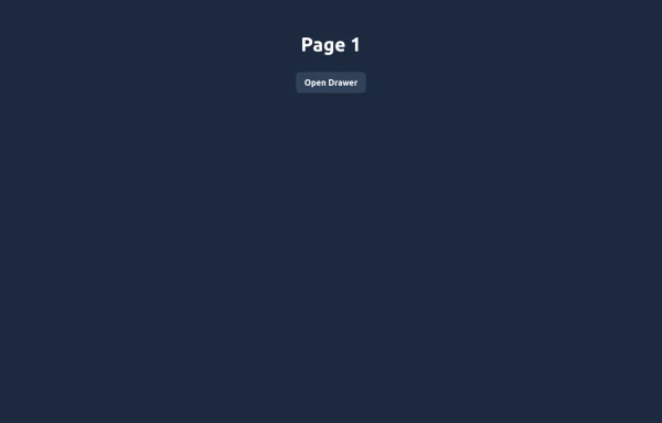 Elegant Animated Drawer
Useful Tailwind classes for constructing an animated sidebar drawer that can be controlled via labels. The component itself is pure CSS and does not require JavaScript to use (although this example uses a bit of JS).
3 weeks ago149


Explore components by Tags
Didn't find component you were looking for?
Search from 2400+ components