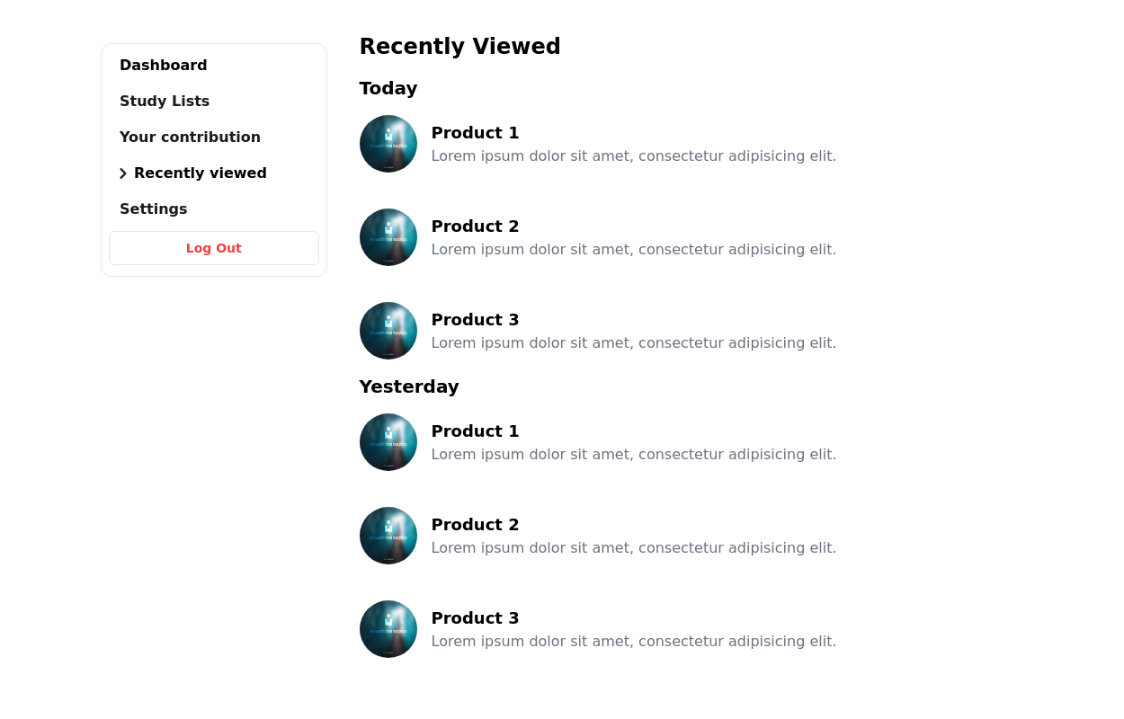
Sticky left sidebar
This tailwind example is contributed by Lucas Martinez, on 12-Feb-2023. Component is made with Tailwind CSS v3. similar terms for this example is drawer

Author Lucas Martinez
Related Examples
-
 3 years ago62k
 -
 2 years ago12.8k
 -
Animated Drawer
Collapsible sidebar navigation that allows users to access additional menu options. It is designed for efficient space utilization and can be easily expanded and collapsed.
2 years ago28k -
 Responsive navbar with dark mode support
Sidebar on small screen devices
3 years ago19.7k -
 Ticket
Sirve para ticket
1 year ago1.9k -
 1 year ago8.3k
 -
 1 year ago2.1k
 -
![Material 3 Drawer (Responsive) [Light]](https://tailwindflex.com/storage/thumbnails/material-3-drawer-responsive-light/canvas.min.webp?v=5) Material 3 Drawer (Responsive) [Light]
Material 3 Drawer (Responsive) [Light]A sidebar drawer that conforms to Google's Material 3 design guidelines. Static sidebar when the screen is >=lg. Collapses into a drawer when the screen is <lg.
9 months ago1.3k -
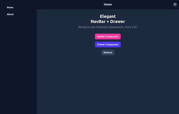 Elegant NavBar + Drawer
A NavBar, a responsive drawer/sidebar, and other useful Tailwind components to get started creating an app. Pure CSS, no JavaScript needed (although this example uses a bit of JS).
10 months ago1.4k -
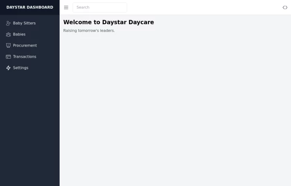 Daystar Day care Dashboard
Daystar Day care Dashboard
1 year ago10.3k -
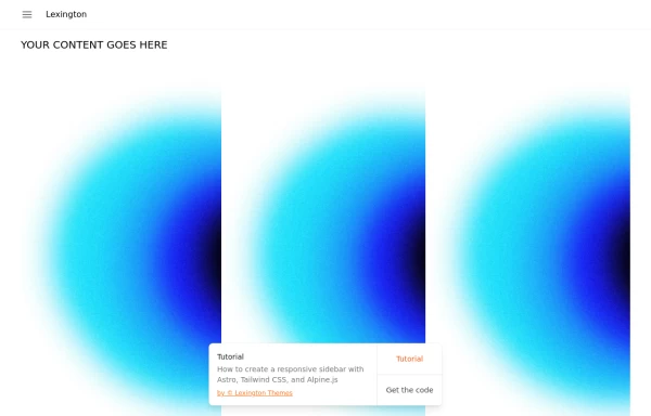
 Sidebar Off canvas
How it Works: Off-Canvas Sidebar Component This component uses HTML5, Tailwind CSS, and Vanilla JavaScript to create a smooth, performant sidebar navigation. The Trigger Mechanism: The Menu Button uses an onclick="toggleSidebar()" event to trigger the opening sequence. We use a semantic <button> tag for accessibility. The UI Structure (HTML & Tailwind): Overlay (#sidebar-overlay): A fixed inset-0 div covers the entire screen with a semi-transparent black background (bg-black/50). It starts hidden and transparent (opacity-0 hidden) to prevent interaction when closed. Sidebar Panel (#sidebar-panel): Positioned with fixed top-0 left-0 h-full, it occupies the full height of the screen. Animation State: We use transform -translate-x-full to hide the panel completely off-screen to the left by default. The transition-transform duration-300 class ensures the sliding movement is smooth. The Logic (JavaScript): The toggleSidebar() function handles the state: Opening: It removes the -translate-x-full class (sliding the panel into view) and removes hidden/opacity-0 from the overlay (fading it in). Closing: It adds the classes back to reverse the animation. Crucially, it uses setTimeout(..., 300) when closing. This delays the hidden class application by 300ms, allowing the CSS fade-out animation to complete fully before the element is removed from the flow. Flexbox Layout: The panel uses flex flex-col to vertically stack the Header, Content, and Footer. The middle section has flex-1 overflow-y-auto, ensuring that if the menu items exceed the screen height, only that area scrolls while the header and footer stay pinned.
3 months ago383 -


Explore components by Tags
Didn't find component you were looking for?
Search from 3000+ components