Button group involves using utility classes
Background colors, hover effects, and animations to the button group using only Tailwind CSS
This tailwind example is contributed by zobaidul kaziex, on 21-Jan-2025. Component is made with Tailwind v3.4. It is responsive.

Related Examples
-
 11.1k
11.1k -
 11.8k
11.8k -
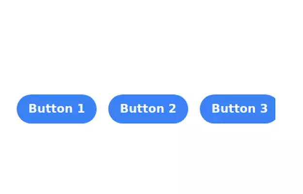 Button group
Monocolor button group
11.8k -

-
 Previous Next Buttons
Pagination buttons
15.4k -
 Adminpanel
Three tabs, switch between each other, change color when clicked. Tables with filter, search, with a drop-down form to fill.
-
 16.8k
16.8k -
 Tailwind CSS Button (Wavy Button)
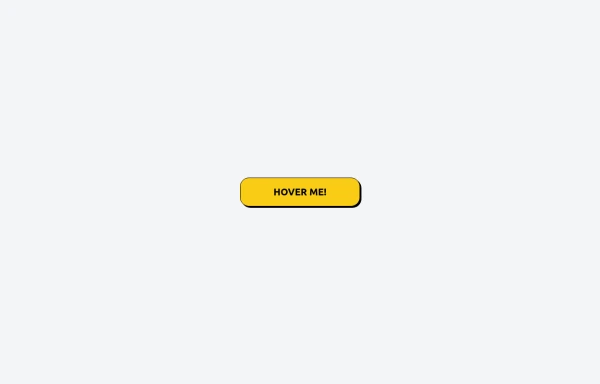
The button uses Tailwind classes for size, background, border, border-radius, shadow, cursor, overflow, and transitions. The wave overlay is absolutely positioned at the bottom of the button, initially off-screen (top-full) and moves to the middle (top-1/2) on hover via the custom .wave class and keyframes. The font-poppins class isn’t a default Tailwind class. You should define it in your Tailwind configuration or replace it with font-sans if you haven't extended fonts.
1.4k -
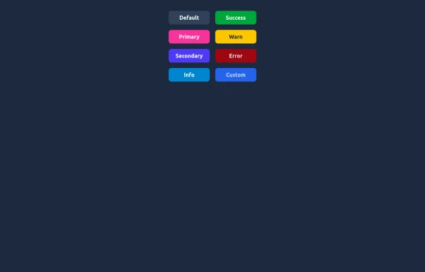 Elegant Buttons
Useful Tailwind classes for creating several types of basic buttons.
1.5k -
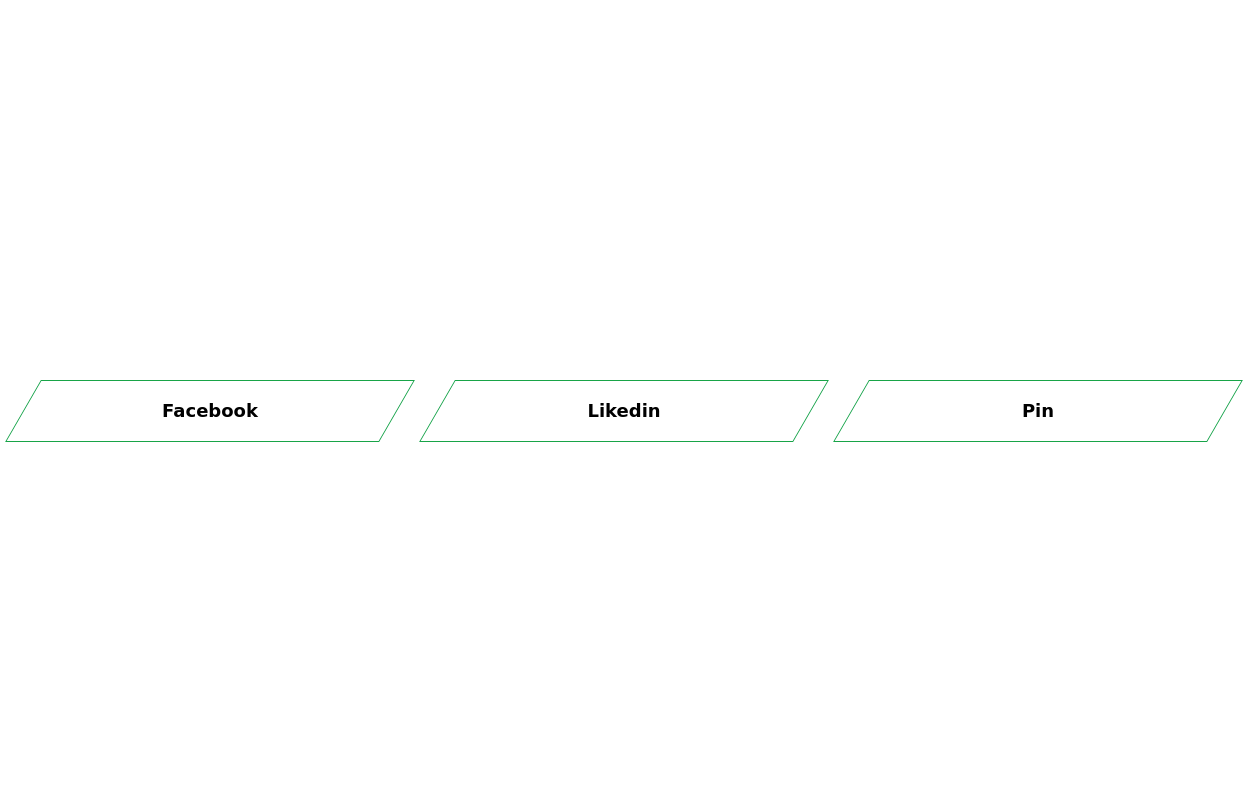
-





Browse by topic
Explore components by Tags
Jump straight to the UI pattern you need.
Can't find it?
Didn't find the component you were looking for?
Search across 3,000+ community-built components and grab the code in seconds.