Tag links component
This tailwind example is contributed by Arya, on 29-Dec-2022. Component is made with Tailwind CSS v3.

Author Arya
Related Examples
-
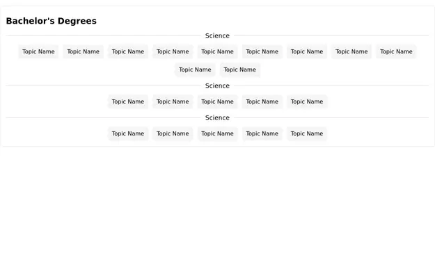 Tag Cloud
Tag cloud with sub-sections
2 years ago13k -
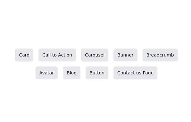 Tag/Button Cloud
Responsive tag cloud. Made with Flex-Box
3 years ago12.1k -
 3 years ago9.2k
 -
 2 years ago13.3k
 -
 Africa Solex Ltd
Description (ibisobanuro bya website) ni text ngufi isobanura neza icyo urubuga cyangwa sosiyete yawe ikora, ikaba ifasha no mu byerekeye SEO (Search Engine Optimization). Mu nyandiko za HTML, description ishyirwa muri meta tag muri <head>.
8 months ago541 -
 2 years ago1.1k
 -
 Tab Menu
Tab menu
1 year ago6.6k -
 Thumbs up and thumbs down buttons
Upvote downvote buttons
2 years ago11.8k -
2 years ago37.8k
-
 3 years ago11.1k
 -
 3 years ago11.4k
 -
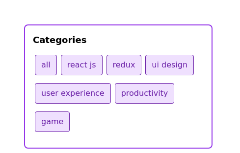
 Multi-Select Dropdown Filter with search
Interactive filtering component built with Alpine.js and Tailwind CSS, featuring searchable multi-select dropdowns with dynamic URL parameters. The system includes responsive design, real-time search functionality, and visual feedback through selected item tags that can be easily removed.
8 months ago1.2k


Explore components by Tags
Didn't find component you were looking for?
Search from 3000+ components