- Home
-
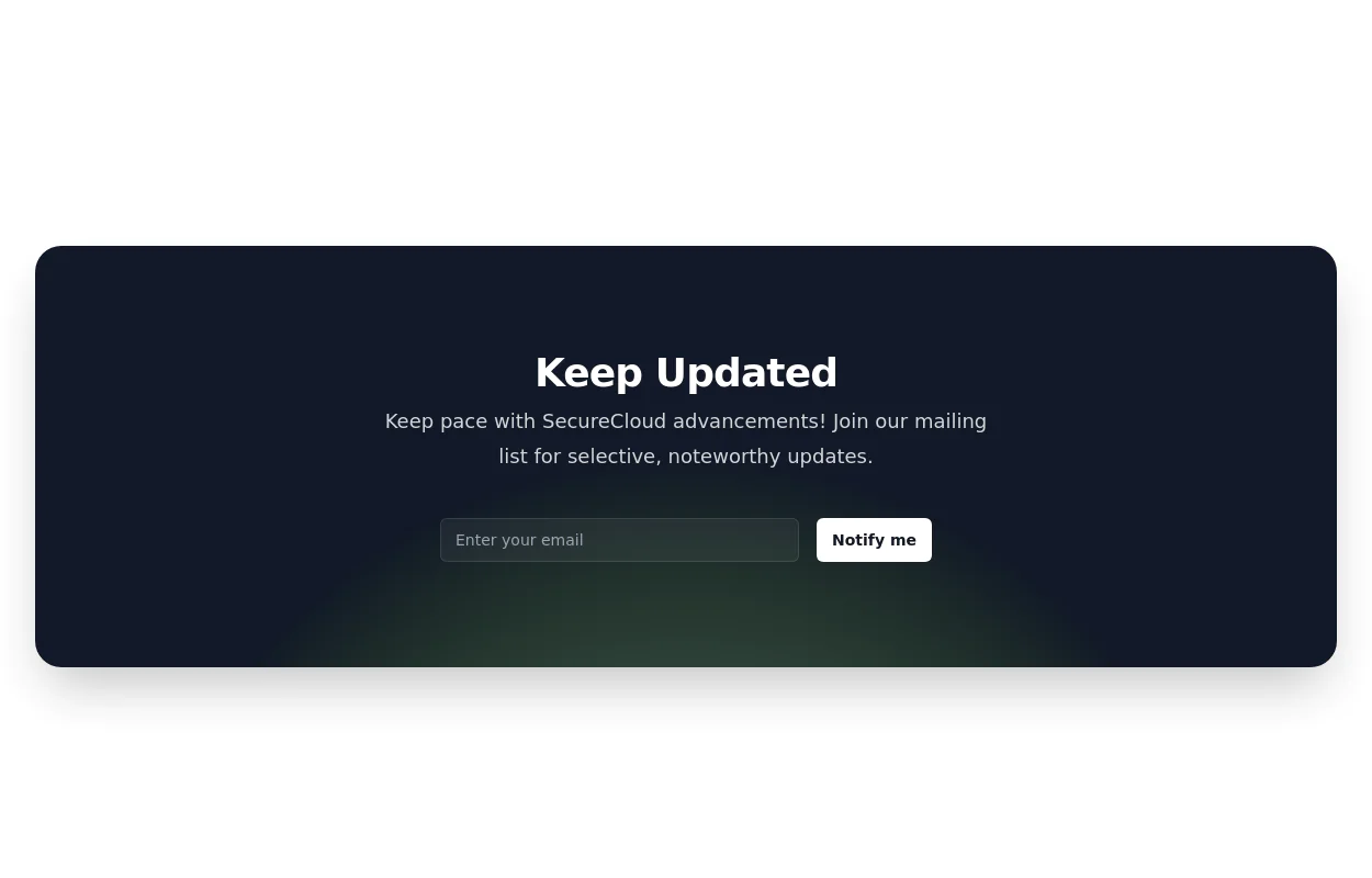
Newsletter Signup Form
Newsletter Signup Form
It features a clean and modern design with a background illustration, making it visually appealing.
This tailwind example is contributed by TailwindFlex, on 13-Oct-2023. Component is made with Tailwind CSS v3. It is responsive. It supports dark mode. similar terms for this example are CTA,banner,Email campaign
Author TailwindFlex
Related Examples
-
Newsletter subscription form
with radial gradient background
2 years ago11.5k -
Modern responsive Newsletter form
Responsive newsletter subscriber form
1 year ago2.9k -
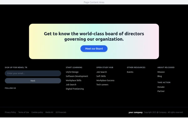
Modern Dark Footer with Overlapping Gradient CTA
A comprehensive, dark-themed website footer component built with HTML and Tailwind CSS. It features a visually distinct overlapping section with a colorful gradient background containing a prominent call-to-action (CTA) block. The main footer area utilizes a multi-column grid layout for organized navigation links, a newsletter signup form, and social media icons. A final bottom bar includes legal links and copyright information. The design is responsive and adapts its layout for different screen sizes.
10 months ago1.1k -
8 months ago865
-
Free Animated Gradient Glow Button with Tailwind CSS
A modern, responsive Tailwind CSS button with glowing gradient hover effects, smooth animations, and an integrated SVG icon. Perfect for landing pages, call-to-action buttons, or any stylish UI project. Fully customizable and open source , ready to copy, paste, and use in your projects.
5 months ago382 -
3 years ago12k
-
10 months ago709
-
Animated Text Rotator | Smooth Tailwindcss Text Transition Effects
Beautiful animated text rotation component with smooth fade transitions. Perfect for hero sections, showcasing features, and engaging website visitors with dynamic content.
3 months ago233 -
3 years ago10.3k
-
Acode master
Welcome to Hamza's official portfolio — a creative developer blending modern design with powerful code. Explore animations, projects, and innovations crafted with HTML, Tailwind CSS, and passion.
9 months ago734 -
1 year ago1.9k
-
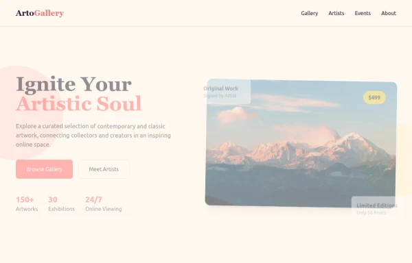
ArtoGallery
Explore a curated selection of contemporary and classic artwork, connecting collectors and creators in an inspiring online space.
9 months ago1.3k
Explore components by Tags
Didn't find component you were looking for?
Search from 3000+ components
